14/4/20- 19/7/20 (Week 1- Week 14) Andrea Vie Choong Jia Qi (0331945) Minor Project Project 1 | Project 2 | Final Project Innovative Project Proposal | Design Management Protocols | Proposed Solution _____________________________________________________________________________ LECTURES Lecture 1: Introduction to the module
14/4/20 (Week 1)
This week, we were briefed with the assignments that are taking place in Minor Project. This project is a collaboration with the computing students. we were introduced to our industry clients that have included their current problem that needs to be solved.
The first step is to prepare a proposal and a proof-of-concept prototype that has to be innovative and creative. In this module, we are required to present professionally in front of a panel of judges (clients) and lecturers from both schools. Most importantly, we need to think about how conclusive is the solution and how good is the prototype quality.
Our group, Jasmine, Jane, Debbie and I are taking on the project called EatWhat. We are required to design and create an application where users can search for a cooking recipe based on the ingredients/groceries they have.
Lecture 2: -
21/4/20 & 24/4/20 (Week 2)
There was no lecture this week.
Lecture 3: -
28/4/20 & 1/5/20 (Week 3)
There was no lecture this week. On Friday, it was a public holiday.
Lecture 4: -
5/5/20 & 8/5/20 (Week 4)
There was no lecture this week.
Lecture 5: -
14/5/20 & 15/5/20 (Week 5)
There was no lecture this week.
Lecture 6: -
19/5/20 & 22/5/20 (Week 6)
There was no lecture this week.
Lecture 7: -
26/5/20 & 29/5/20 (Week 7)
There was no lecture this week.
Lecture 8: -
2/6/20 & 5/6/20 (Week 8)
There was no lecture this week.
Lecture 9: -
9/6/20 & 12/6/20 (Week 9)
There was no lecture this week.
Lecture 10: -
16/6/20 & 19/6/20 (Week 10)
There was no lecture this week.
Lecture 11: -
22/6/20 & 26/6/20 (Week 11)
There was no lecture this week.
Lecture 12: -
30/6/20 & 3/7/20 (Week 12)
There was no lecture this week.
Lecture 13: -
7/7/20 & 10/7/20 (Week 13)
There was no lecture this week.
Lecture 14: -
14/7/20 & 17/7/20 (Week 14)
There was no lecture this week.
_________________________________________________________ INFORMATION Module Information Booklet (MIB)
__________________________________________________________ WRITTEN TASKS DESIGN INNOVATION & DISRUPTIONS
14/4/20 (Week 1)
A. Please describe what is Design Innovation based on the article "What is Design Innovation? by Alex Obenauer". Please cite some examples to elaborate your observations.
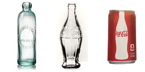
Design Innovation is a design process which has a basic innovative concept or design which changes the way how the user interacts with the product. This innovation has a required amount of taste, empathy, creativity and various inputs or perspectives. Design Innovation consists of a list of principles which include contextual, empathetic, goal-oriented, intentional and iterative. Examples: 1. Cola-Cola Bottles
The Coco-cola bottle represents the design innovation to reach particular business goals. Coca-cola launched a new bottle design that is inspired by the shape of a cocoa pod (Obenauer, 2016). It has helped Coca-cola to become a famous product in the world. The shape became recognizable that it is used as an image on the company’s cans (Obenauer, 2016).
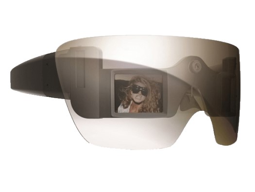
2. Lady Gaga’s Polaroid Camera Glasses
Polaroid signed up with Lady Gaga and made her as the creative director of its Grey Label line of their products (Quick, 2011). She has helped design this product. It is a digital camera that prints photos and a mobile printer using ZINK’s Zero Ink thermal printing technology (Quick, 2011). It is a pair of sunglasses that feature a built-in camera to take photos and videos. To see the results, LCD screens are designed into the lenses to display them (Quick, 2011).
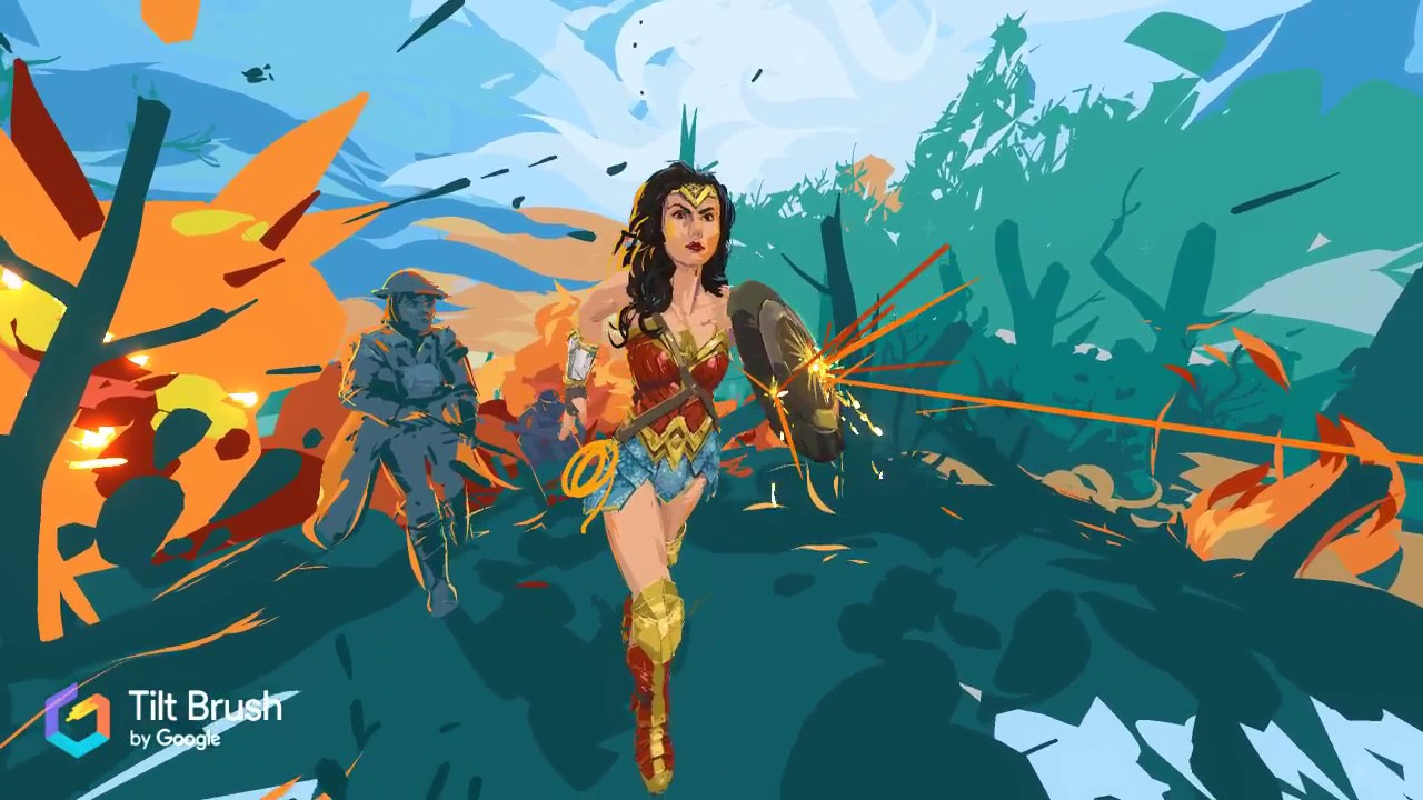
3. Tilt Brush
Tilt Brush is Google's tool to give VR experiences to create digitally and in 3D. Using room-scale tech, that tracks movement through a restrained area, the app allows users to paint in space with materials such as fire, snowflakes and a variety of palette of brushes and colours (Innovation By Design, 2016). When work is complete, users can walk through their artwork or invite other people into the masterpiece they have made (Innovation By Design, 2016). 4. ClassDojo
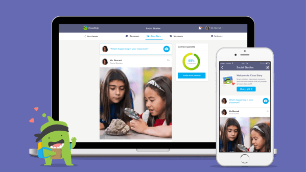
ClassDojo is an app which has a feature to enable teachers to share classroom photos and videos with parents who would like to keep track of their children daily (Innovation By Design, 2016). ClassDojo also gives teachers an easy way to communicate with parents, which increases their relationship and transforming them into a true teaching team (Innovation By Design, 2016). Administrators can connect with parents and share information on upcoming school events, important announcements and many more (Innovation By Design, 2016).
ANSWERS: Design Disruptors are people who create things that are from a new perspective and something that no one has ever thought about it before. They are ready to get off their comfort zone to bring new innovation to the current world. They pay attention to the user interface and user experiences. That is why they love creating prototypes that allow user testing. Overall, they see design as a living organism which develops and adapts to the new environments. They look into existing products or services in the industry and think of how they can make them more efficiently, faster and simpler. They solve old world problems and revolved them into new technologies. They focus and understand opportunities and make inventions from them. They think design as a human being and provided something that satisfies their needs and wants. One example would be when Facebook came up with the idea called '2G-Tuesdays'. '2G-Tuesdays' allows employees to switch to a simulated 2G connection for one hour to experience the product/service similar to how users from emerging markets do. It makes designers and engineers experience the weaknesses that many users would have in real life. From this, they realize how it is like to use a non-lastest or fastest connection (Design Disruptors, 2020). Another example is Netflix. Netflix is continuing to disrupt the entertainment industry (Daisyme, 2018). They have reduced the number of physical video rental stores and allow more customers to cut out their cable subscriptions (Daisyme, 2018). It changes the way how users can entertain themselves. Besides Netflix, Grab is a disruptor as it is a ride-sharing company which revolutionised public transportation (Chua, 2018). It has been popularly used in Southeast Asia. It launched GrabCar which allow users to hire rides from licensed drivers instead of taxis (Chua, 2018). Users have said that it was a better way in using especially during peak-hour shortages of public transportation (Chua, 2018).
__________________________________________________________ MINOR PROJECT PROJECT 1 Innovative Project Proposal
Consultation 1 17/4/20 (Week 1) Our group had our first consultation with Mr. Mike and shared on how we are supposed to work as a team with the IT students. We were given a sample proposal, Capstone Project Proposal. The steps on writing on a proposal are given to guide us when writing the proposal for EatWhat. Google drive link to Capstone Project Proposal: https://drive.google.com/file/d/1LHQ0m99TDglyPRxNbvkOgaEjNthJEbSH/vie
Before going ahead with this project, we need to know about our competitors in the market that are in the same line of service with EatWhat. In this case, background research.
Things to analyze when doing background research: 1. Identify the platform they are using it and why? 2. What is their weaknesses/pain points? 3. What are the problems they cannot solve? 4. What are their customers demand that they are struggling to deliver? Google slides & docs links to websites/app research: Research #1:
Team Meeting 1 & After Meeting 18/4/20 (Week 1) We met with our IT team (Sze Hao, Evelyn and Thomas) along with lecturers from Design and Computing School. We listened through their proposal briefing for EatWhat project presented by our project manager, Sze Hao. We also met with the client. After the meeting, we had a short discussion and q&a session with Mr.Mike as we have some things to clarify. We need to do research on existing websites and apps to identify the design/visual, user experienceand content. Here is the embedded slides of the project brief: ---------------------------------------------------------------------------------------------------------------
Consultation 2 21/4/20 (Week 2)
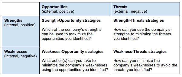
We had our second consultation with Mr. Mike on the progress of our research. We are supposed to analyze the EatWhatwebsite and app and see what areas are EatWhat winning or losing out? Compare it with at least 5 other strong websites/apps. For examples, features to showEatWhat is stronger as a market leader brand or help it stand out among the rest. You can look at whether EatWhat is multi-lingualso that users from other parts of the world can understand what the website or app is about. Just like Grab. Make use of SWOTanalysis to analyze the websites/apps.
Team Meeting 2 22/4/20 (Week 2)
We had an online discussion with the IT team to clarify the key points we prepared from our previous consultation and know exactly what our job scope is for this project. From this week onwards, we need to come up with a project name as “EatWhat” is still an idea for the name. By this week, we should do a SWOT analysis on the project’s website.
We had our third consultation with Mr. Mike and we showed him our progress of the SWOT analysis. There were some amendments we had to make as he went through all the points and summarize them into four categories. Besides the SWOT, we had to come up with several user personas to know how different groups of users use the recipe website/app. We had to think to finalize the brand name, brand personality,creative strategyand big idea. We can look from referenced examples from global brands. This is to help us establish the purpose and what makes our brand unique from other brands. Here are websites that could help us with thinking about our brand personality, creative strategy & big idea:
We had our fourth consultation with Mr. Mike on to confirm our summarized points for the SWOT analysis. We had to finalize ourbrand namewith our IT team so that we can move on to the brand personality and big ideas. Other than that, we need to gather respondents for our user personas created in different categories. User persona categories: Persona 1: A family with 4 or fewer members Persona 2: Individual with financial constraints Persona 3: A family man/woman cooking on a daily basis Persona 4: A young couple living in the city Persona 5: A family with financial constraints Here is a list of questions that we will ask the respondents for each persona: 1. Do you plan your meals ahead of the day/week? 2. Have you faced situations where you don’t know what to cook or eat for your next meal? 3. If yes, how would you overcome these situations? 4. Would it be helpful if there was an easy-to-use, impressive application you could download to suggest what your next meal would be? 5. How many people do you usually cook for? 6. Do you take note of dietary requirements while you cook? 7. Do you think including additional information such as allergy warnings and how many servings to recipes is helpful to you? 8. Does budget play an important role when preparing meals to cook? (Example: expenses of the ingredients etc.) Research on SEO domain name:
Fig 1.6 SEO Domain Name
Team Meeting 3
29/4/20 (Week 3)
This week, we had a meeting with the IT team. We briefed on our SWOT analysis, name and reasoning to them. We explained on the user personas we had to do for each category and suggested them they can help us in gathering respondents as well.
5/5/20 (Week 4) In our 5th consultation with Mr. Mike, we told our official brand name for our project, Feast-in and the reasoning behind it. We shared our ideas on our big idea and brand personality. From the feedback we got, we were confused with what the big idea exactly means. The big idea is based on a catchy phrase along with a creative strategy and a question to consider is "What is the mentality/mindset that connects to your brand personality?". As we thought of our big idea, we thought of relating it to Masterchef. From the big idea, we can move on to coming up with the brand personality. Apart from that, we need to start working on the art direction (mood board) for the branding. We can use Miro Board to do so. Most importantly, find out about the flowchart/information architecture of both website/app for the IT team.
For our 6th consultation, we showed our new big idea and brand personality. So far, we are on the right track but the "master" from the chef can be taken out and use the word "chef" or "hacker" in the sellable phrase. Think of a chef that is sent to a rural area where there are limited resources and traditional cooking equipment to use. We are suppose to summarize our ideation in Miro Board. We need to lock down our big idea and brand personality as soon as possible and start with the creative strategy and art direction.
We are not aware of what creative strategy is so we look at our senior's proposal and their mockups for different media channels. From that, we could understand what creative strategy is. Our project is a small scale so we just need digital media or social media.
For our creative strategy, we looked into the marketing sales and brand message with types of executions to spread the awareness of our brand.
Here is our progress of the creative strategy:
Fig 1.7 Research/Exploration: Creative Strategy
As for the art direction, we looked into the main principles like typography , colour, visuals and layout with given examples.
From our consultation with Mr.Mike, we showed our progress in our research and exploration for the art direction and creative strategy in Miro. The research is fine and we just need to finalize the art direction and creative strategy for our execution. Most importantly , the flowchart is needed to help with the layout of the wireframes. Use references/create moodboards of existing recipe website layout to support the layout designed for your Feast In website.
Here is the embedded slides of the final art direction & creative strategy for
This week, we showed our final execution ideas for art direction & creative strategy. Although our proposal is good to go, we still had lack of justification in our creative strategy. We had to to two phrases:
1. How to get users to know about Feast In and visit the website/app
2. How to get users to keep visiting the website and use the app frequently.
Here is the embedded slides of our creative strategy:
Before today's consultation, Jane has compiled a separate file of slides to pass on the final idea of the art direction including the logo development to one of the IT team member, Sze Hao so that he can propose the idea to the client.
Here is the embedded PDF of the art direction & logo development :
From the client's feedback, he did not want the website to look too corporate with dark colour schemes and he is alright with the proposed logo design 1 and 2. But most importantly, we need to have our reasoning behind on what we propose. Jane went ahead to adjust the colour scheme to a more brighter tone to make it look less corporate. All of us including the IT team came to a conclusion to use the newer colour scheme.
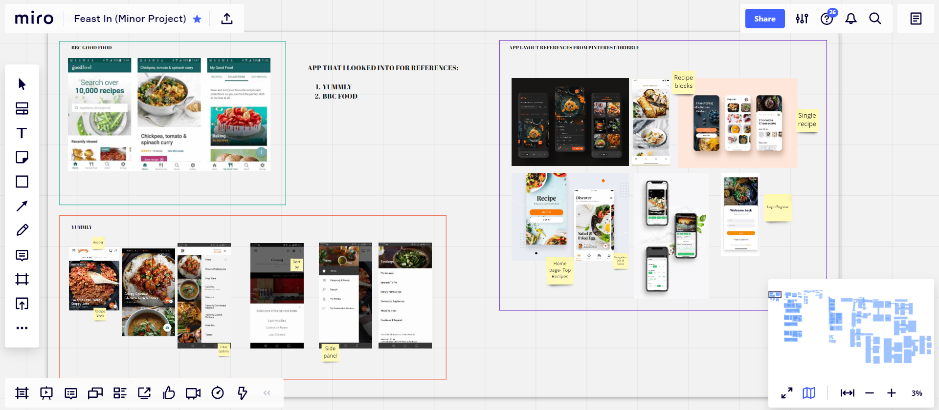
As on my side, I had to continue to look for referenced layout of existing website to support my layout for the Feast In website.
Here are the referenced layouts I have compiled in Miro:
Fig 1.9 Moodboard References: Landing Page before login/register
Fig 1.10 Moodboard References: User Page after login/register
Fig Moodboard References: Admin Page
Besides that, I was told to make a style guide from the final art direction and create 2-3 style variation using the art direction in some parts of the wireframes. After that, I sent the variations to rest of the design team members to decide which ones they prefer.
Here are the style variation:
Style 1
Fig 1.9 Style Variation 1
Style 2
Fig 1.10 Style Variation 2
Style 3
Fig 1.11 Style Variation 3
Style 4
Fig 1.12 Style Variation 4
All of them prefer the 2nd one. So I went ahead with the 2nd style and adjust the visuals of the recipe thumbnails and background images to match the theme from the photos Jane sent to test them out.
For our consultation, Jane present our creative strategy ideas and creative execution. Our creative strategy was alright except we need to summarize the research/analysis part and focus more on the flowchart and creative execution.
As for the wireframes, the moodboard references and style guide was alright. Except the style of the website design is focus too much on aesthetics rather than functionality or legibility. Mr. Mike said to avoid using background images with overlay shapes on top. Use more of a textural background or solid colour.
During this consultation, we all present on our own parts of the project. I present on the modified website design while Jane present the logo development and creative strategy flowchart. Debbie and Jasmine were in charge of the creative execution phases. Debbie showed her storyboard for motion graphics and Jasmine showed her storyboard for the YouTube ad. At the end, Jane mentioned about the client's feedback on our progress.
Progression of ideas:
My part
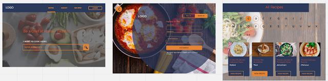
Fig 2.1 Progress of website design
Debbie
Fig 2.2 Progress of storyboard ideas for motion graphics
Jasmine
Fig 2.3 Progress of scenerio ideas for youtube ad
Jane
Fig 2.4 Progress of logo development
The client was alright with the branding, big idea. brand personality, art direction and creative strategy. For the logo, he preferred the left colour combination. For the creative strategy, we were told to focus on phrase 2 rather than phrase 1.
There was no consultation toady as it is a public holiday.
This week, I worked on changing the colours of the website from the feedback during the last consultation. And from that, I modified the style guide accordingly.
Here is the updated website design:
Fig 2.5 Progress of editing colours
After revising the colour of the design, I moved on designing the USP icon. I wanted the USP icon to reflect on the social media icon that was designed but with some changes of the colours.
Fig 2.6 Progress 1 of USP icon
I discussed my USP icon together with Jane and she said it would be better to include the "add icon" and make the same colour for the f and smoke lines. She helped in modifying the icon.
Fig 2.7 Progress 2 of USP icon
I placed both icons on the website to see how it turns out.
We presented our progression for our own parts as usually and received feedback accordingly. We had to finalize the website UI so we can finalize the design for the poster, motion graphics and YouTube ads.
My progression (Website UI and USP icons):
Fig 2.8 Website UI design & USP icon design
Jane's progression (Logo development and Facebook/Instagram feed):
For Tuesday's consultation, we summarized what we discussed with the IT team and the feedback we got from them. I presented my modified wireframe designs while Jane presented her progress on the logo, usp icons and icons for the app store.
We presented on our parts separately. Me on the wireframes (especially landing page), Jane on the posters, Debbie on the motion graphics and Jasmine on the ideation for the Youtube ads.
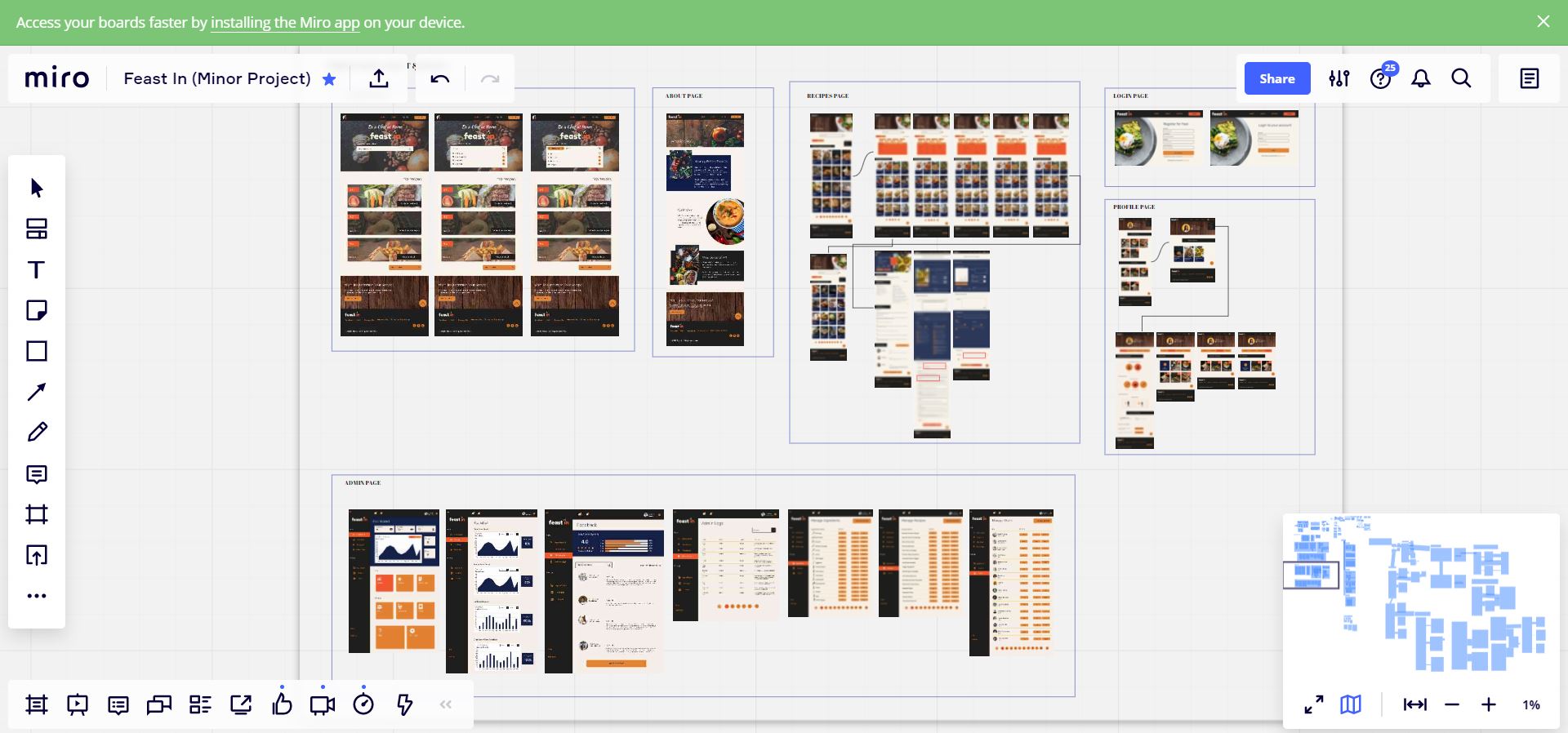
Fig 2.17 Progress of wireframes
Fig 2.18 Progress of posters
Fig 2.19 Progress of motion graphics
Fig 2.20 Ideas for Youtube Ads
After the consultation, I continued to work on the wireframes by adding the colours/images.
I quickly outlined the changes I made from Tuesday’s consultation on the wireframes.
Fig 2.28 Modified changes #1
Fig 2.29 Modified changes #2
Fig 2.30 Modified changes #3
Meanwhile, Jane outlined the things that she discussed with the IT team about which elements are supposed to hover. She also presented her progress on the posters.
Fig 2.31 Progress of Facebook headers
Debbie showed the animation she did for the loading screen and she said she will start on the website animation.
Jasmine showed the storyboard with the wireframes visuals.
Fig 2.32 Progress of modified storyboard with styleframe
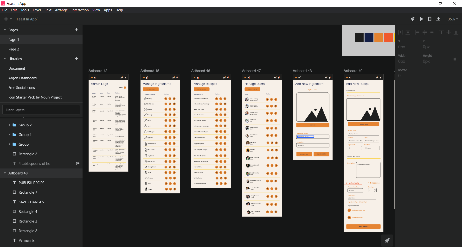
In this consultation, I presented my app layout wireframes that I have done so far.
Fig 2.33 App Layout References
Fig 2.34 App wireframes progress 1
Jane showed her FB and IG posts she designed on the mockups. For the web animation transitions, Debbie showed her progress so far with the landing page, admin page and about page. She will get these animation done as soon as possible and start the motion graphics. And finally, Jasmine showed her progress in making the 3 Youtube ads video.
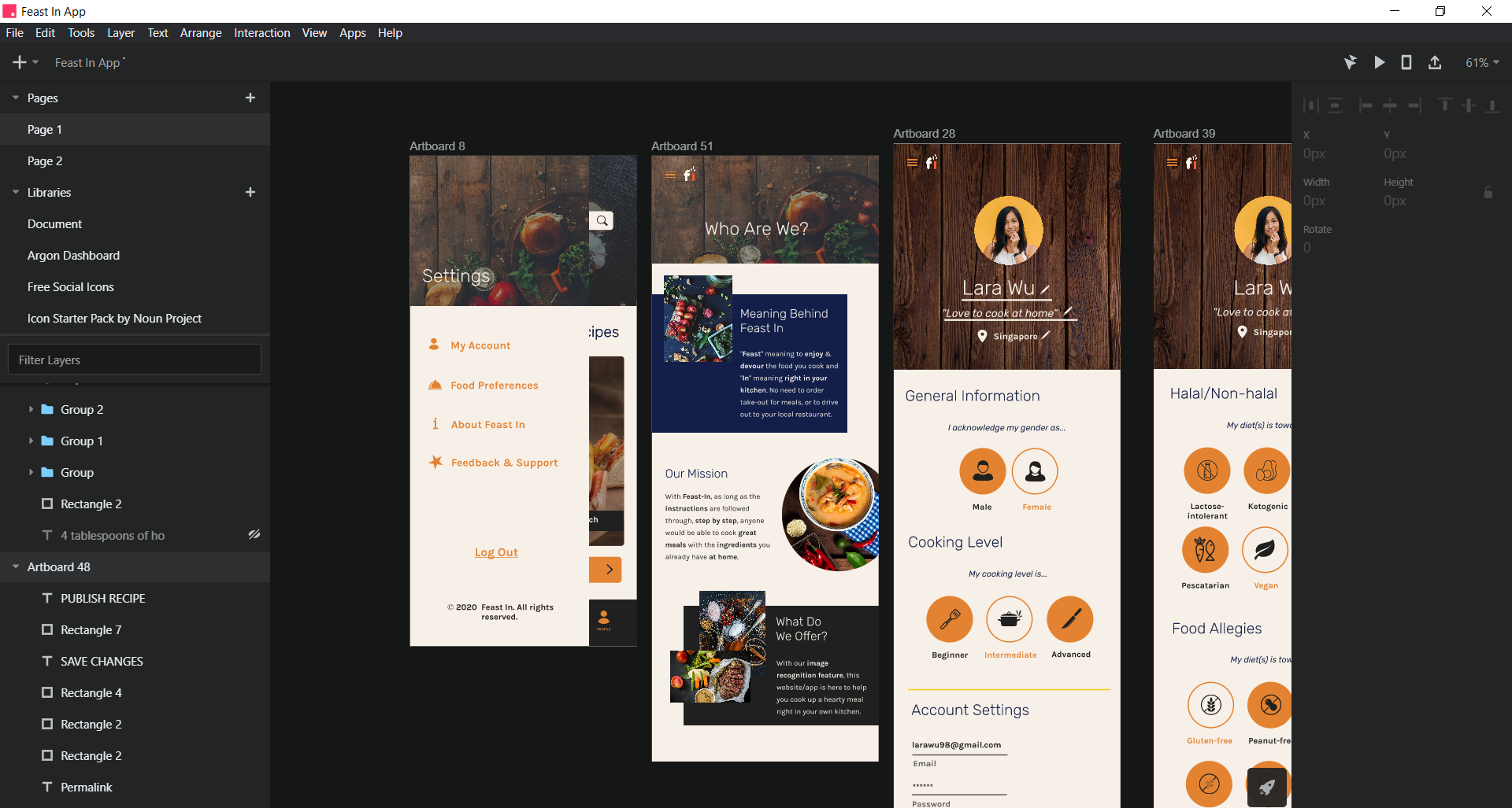
For today's consultation, I showed the changes I made in the app wireframes and my progression on the profile screen along while Jane helped me to highlight the changes as well.
Fig 2.35 Garlic butter steak single recipe screens
Fig 2.36 Profile Settings Screen
Fig 2.37 Profile Screens
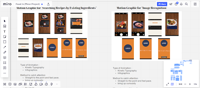
Debbie presented 2 motion graphics: search ingredients and image recognition. Jasmine showed her progress in making the 3 Youtube ads: 1st & 2nd USP videos & bumper ad.
I presented my progress on designing the profile settings, about screen and admin screens.
Fig 2.38 Side Panel, Profile Settings & About screens
Fig 2.39 Admin screens #1
Fig 2.40 Admin screens #2
Debbie presented on the app animations and 2 motion graphics. Jasmine showed her progress in the 3 Youtube ads. And Jane informed on her progress with the final presentation slides that she has done so far. We had to come up with a pop-up or a section to promote our ups of using the image recognition feature on the website although we have promoted it in our creative executions.
In today's consultation, I presented the changes I made in the app wireframes from last week's consultation.
Fig 2.41 Adding the black border around the hamburger icon & logomark
Fig 2.42 Change recipe blocks vertically & add the plus sign boxes
Fig 2.43 Vertically scrolling of the dashboard category boxes
Jane proposes 2 ideas for the pop up to promote our image recognition feature on the website. As well as an additional way to promote by giving more information about the image recognition in a section of the "About" page. We all agreed to go ahead with the 1st idea to make the pop up appear after a certain duration in the landing page. Debbie showed her progress in the motion graphic teasers. Jasmine showed her storyboards for the 3 videos.
Fig 2.44 2 Variations of Pop Up Design
Fig 2.45 Idea 1: Pop Up appearing after a certain duration in the landing page
Fig 2.46 Idea 2: Pop Up appearing after a user clicks on the search bar in All recipes page
Fig 2.47 Additional information about the image recognition in About page
Jasmine showed progress on the Youtube ads. We have to adjust some parts to match with the user personas. For the final presentation, Mr. Mike advised that we should finish up the slides first then he will go over the flow of the slides.
Meanwhile, I added the pop up panel into the website wireframe.
This Tuesday, Debbie showed the changes made for the motion graphic teasers. Jasmine showed her progress in the 3 Youtube ad videos.
Finalized motion graphics:
A. Image Recognition (teaser)
B. Image Recognition
C. Searching Ingredients (teaser)
D. Searching Ingredients
We highlighted the changes made to the idea of the videos. There were changes made to the ideas of the 4 personas ad videos. Initially, for persona 2, it was going towards catering recipes a large family. But since we clarified with the IT team that the serving number will be fixed and not change in the recipe customization, we made some changes to that persona video. For the 3 other videos, there is some amends made in the ideation.
Persona 1: Individual - Don't know what to cook? Open the fridge, see what ingredients there are, put in Feast In and the website generate recipe.
Persona 2 - Big Family - 4 kids, 2 kids like chicken 2 kids like prawns but the recipe is “Chicken Lettuce Wrap” (for example) so the idea here is: Customize your recipe by adding in prawn to this specific recipe.
Persona 3 - Individual - Cooked something from Feast In and enjoyed the meal, Save it! No need to look for it again, just save and next time it’s in the “Saved Recipes” under the profile
Persona 4 - Individual - Want a similar experience/taste of fine dining but don’t want to spend too much money, use feast in to cook a nice meal!
Jasmine showed the ad videos and she needs to change some of the images to a high resolution and remove the swiping sound effect. For our slides, we had to show our work to the full screen until it fits the height of the presentation screen. We need to prepare the script on what we are suppose to say for the final pitch.
Throughout this whole Feast In project, I learned the key to make this project work is to have good communication with our group mates from both the design and computing team. We did a good job in managing our own separate task, helped and gave feedback accordingly to each other. I feel that we are active towards giving updates and progress in our task and so that we are aware of what each of us is doing. Besides that, during the consultations, I am glad that we are able to give weekly progress for our project and get back comments/feedback from Mr.Mike on how we can improve the outcome of our work. As for the final pitch to the client and lecturers, we practiced together as a team several times before the actual final pitch on Sunday 1pm and delivered our presentation smoothly.
17/4/20 (Week 1) Specific feedback:There are some things to take note of when working in a team. We need to analyze what are the capabilities, both strengths and weaknesses of our teammates when working with the client. Do background research of the competitors in the market that are in a similar category with EatWhat (at least 3). Use SWOT analysis as a guide. Research on the technical challenges of the app. We need to remember to not rely solely on the skills we learn previously, use the skills we are learning right now.
21/4/20 & 25/4/20 (Week 2)
Specific feedback: We need to think about what makes EatWhat a website or app that leaves an impression on people. How is it different from any other recipe website or app? Is it the features that make it unique?
28/4/20 & 1/5/20 (Week 3) Specific feedback: We need to make sure your brand name is not used before. Check using the SEO domain name. We have to finalize your brand name as soon as possible, discuss it together with your IT team. You can get help from your IT team on your user persona respondents as well. 5/5/20 & 8/5/20 (Week 4) Specific feedback: Big idea is supposed to be a catchy phrase where it reflects on the question “ What is the mentality/mindset that connects to your brand personality? Look at examples of existing brand’s big idea. For instance, Nike. It motivates people to not overthink and “just do it.” From this discussion, we relate our project to helping users become “Masterchef.” It would be better to start referring to Masterchef and their creative strategy.
12/5/20 & 15/5/20 (Week 5)
Specific feedback: Finalize the art direction and creative strategy for our execution. Add justifications as to why do you propose such platforms to promote Feast In. For the wireframes, I had to create a style guide from the final art direction and create 2-3 style variation using certain parts of the wireframes.
19/5/20 & 22/5/20 (Week 6)
Specific feedback: Summarize the research and focus on the flowchart and visual execution sample for the creative strategy. As for the style of the wireframes, I should avoid using food-related images as a background. It would be more legible if I used backgrounds that are texture based or solid colour. Do not use use overlay shapes/background on the images. After friday's consultation, Mr. Mike commented that the website looks masculine and he said to change the blues to the white to match with the moodboard references. He suggested an idea to create an icon for the USP of the website on the landing page.
29/5/20 (Week 7)
Specific feedback: We were on the right track for this project. From everything that we do, we must remember our brand's tone of voice is friendly, local and relate back to our user personas. We need to finalize the website UI in order to proceed with the creative executions.
2/6/20 & 5/6/20 (Week 8)
Specific feedback: Mr.Mike suggested to not put the logo in the home page as it is not functional. So it would be better to place it below the "Be a chef at home" would look nicer if it is changed to a brush type of font like the one proposed in the poster design. The rounded corners of the search bar & recipe blocks should follow the consistency with the text input. For the YouTube ad videos, ideation is the key to make the ads effective enough to attract the users and make them keep watching the ads. The technical part should be considered later. If the left corner of the navbar is too empty, then add in the "fi" icon. As for the poster, Jane suggested that she could add the off-white as borders around the poster and Mr. Mike said that is fine. For the motion graphics, Debbie should be it based on a app layout. For the Youtube ads, Jasmine can go ahead to illustrate the storyboards.
9/6/20 & 12/6/20 (Week 9)
Specific feedback: For Tuesday’s consultation, I need to make sure that the website wireframes should maintain a consistent style and are easy for the users to understand what the users are supposed to do on each page.For the image recognition As for Jane, the poster designs are good overall and there is consistency. For Debbie, she doesn’t need to add too much animation especially for the hover effect as the users will already know what is clickable or not. For Jasmine, the storyboards for the YouTube Ads are good so she has to show the storyboards that follow the images & colours used in the wireframes. From Friday's consultation, I had to adjust the wireframes to an actual web size viewed on a browser. Mr.Mike said Jasmine can start executing the animatics for the Youtube ads once all of us agree. But by next week, we need to show progression on the app wireframes.
16/6/20 & 19/6/20 (Week 10)
Specific feedback: On Tuesday, I showed my app layout progression. Mr. Mike said it looks functional and consistent and I should watch out for my grammatical mistakes in some parts. Jane showed her progression in the IG and FB posts. Mr. Mike commented to make the “all year round” header more striking and make the image recognition post for IG design to match with the other posts. For Debbie, she showed her animated web pages. Mr. Mike said to make sure the slide in transition is not only designed for one page but to other pages as well for consistency. He suggested that she should finish up the animation and help Jasmine through the Youtube ads as there are the most important parts. As for Jasmine, she showed her progression for the 3 videos. Mr. Mike suggested that the ad video should follow the frame and use a screen captured ad in Youtube to refer to the sizing.
23/6/20 & 26/6/20 (Week 11)
Specific feedback: In Tuesday’s consultation, the wireframes for the app were approved but I need to check the spelling on the word “Briyani”. The wireframes for the website/app will be sent to the IT team so they can use it when they start on the prototype. So far, they have not started yet but they will soon. Debbie presented the motion graphics. The feedback was the size looks really long but we clarified that it was the actual size of the iPhone X and in the wireframes tool. The music volume can be reduced so that it does not overwhelm the viewers. The motion graphics for the image recognition, the camera black border should reach to the top of the screen and leave the menu icon and “fi” logo sitting into the border. The “Feast In” title and tagline is too close to the screen edges so it would be better to adjust the spacing. For the Youtube ads, 1st USP video, the grey box should be changed to dark blue and the “chicken” word to orange. The light and dark blue shade looks weird and it looks like it separates the “What are you” and “waiting for”. For the bumper ad, the 2nd scene slides away too fast and the viewers can’t finish reading all of the 4 frames. The words can be shortened as well like “Save Money?, Big Family?, What to Cook? Future Meals? And lastly, Jasmine needs to create 3 more versions of bumper ads so it balances out with the current bumper ad. Most importantly, we should start compiling on everything we have done into slides. We discussed with the IT team yesterday and we agreed that both sides will create our own set of slides then compile the standardized slides for the final presentation.
For Friday’s consultation, the swiping effect in the admin page should have an arrow on the right to indicate that the user can swipe through them. I need to add a black border for the hamburger icon & logo mark to be seen. We need to consider how the image recognition icon can be easily recognized and seen by the users when they go to the website/app. For the motion graphics, Debbie needs to create one teaser Instagram story that would introduce both usps. The tagline should be right below the logo. As for the Youtube ads, Jasmine needs to take note of the text alignment, phrases used should be straightforward and progression on the storyboards for the 3 other bumper ads by next Tuesday’s consultation. For the final presentation, Jane mentioned whether we need to include the SWOT in the slides. Mr. Mike said we need to discuss with the IT team to agree on what should be in the slides or what is not.
30/6/20 & 3/7/20 (Week 12)
Specific feedback: In Tuesday’s consultation, I present the changes I made from last week’s consultations. Mr.Mike said the app wireframes look all right and I informed him that I will send the wireframes to the IT team after this. Jane proposed 2 ideas to promote our image recognition using a pop-up & a section in the “About” page. We agreed to use the 1st idea which is to put the pop up at the landing page and will appear after about 15 seconds. Debbie showed her progress on the 2 teaser motion graphics. Mr.Mike said to add a pop up to let the users know about the image recognition like in the website. Jasmine showed the storyboard for the 3 Youtube ads. Mr. Mike suggested reducing the number of words and making them simple & clear to understand for the voiceover. We were informed about the things that we discussed with the IT side about the structure of the slides, popped up for IR and clarified with them that there will be a prototype for the website/app. We had to constantly get updates from them to know what’s going on for both sides.This Friday, Jane and I didn’t have anything to show as we are done with our parts.Debbie showed the changes made for motion graphics. Only the phrases used need to be shortened & simple. Jasmine showed progress on the Youtube ads. We had to change the last persona to match with the save recipes function in the website/app and adjust the recipe to match the personas.
7/7/20 & 10/7/20 (Week 13)
Specific feedback: This Tuesday, Debbie showed the changes made for the motion graphic teasers. Jasmine showed her progress in the 3 Youtube ad videos. There were a few changes to be made and she only had to add in the voice over and background music. As for the final presentation, Jane asked whether the finalized UI designs need to be shown since the IT side is not going to present the prototype. Mr.Mike said the finalized UI designs can be presented through Invision itself. We were told that we had 2 more consultations before our final pitch in Week 14. We told Mr .Mike that we would be showing the slides that we were going to present for our final pitch by this Friday. On Friday, Jasmine showed the ad videos and she needs to change some of the images to a high resolution. As for the slides, we need to enlarge all the work we have done to the max height of the presentation screen. Mr.Mike suggested having a proper script before the final pitch to avoid unnecessary speech filers.
14/7/20 & 17/7/20 (Week 14)
Specific feedback: For the ad videos, he said to make sure the kerning of the text is not too close so it will be easier to read when the video frames run fast. Some images are told to be changed to high resolution ones if it can be replaced. We clarified with Mr.Mike that the website & app layout will be shown through Invision. For the ad videos, he said it would be better to play them straight from Youtube. We were told that the timing of the final pitch should be around 15-20 minutes. For the final pitch, we need to make sure whether we are using Teams or Zoom and make sure the whole final pitch is recorded. The audio should be clear and loud. During the final pitch, we should turn on our video camera at the start and end only as it will be lagging if it is switched on throughout the meeting. When passing the presentation to the next presenter, make sure it goes smoothly. All in all, we need to rehearse and practice with our script to have confidence before Sunday.


Comments
Post a Comment