INTERACTIVE DESIGN- FINAL PROJECT

20/6/19 - 4/7/19 (Week 12 - Week 14)
Andrea Vie Choong Jia Qi (0331945)
Interactive Design
Final Project
Design, Exploration & Practice
_______________________________________________________________
LECTURES
Lecture 11:-
20/6/19 (Week 12)
We had no lecture this week as we start to do our final project and discuss our content with our partner.
Lecture 12:-
27/6/19 (Week 13)
We had no lecture this week as we continued to do our final project with our partner in Dreamweaver.
Lecture 13:-
4/7/19 (Week 14)
We had no lecture this week as we continued to do our final project and upload the progress in our blog.
__________________________________________________________
INSTRUCTIONS
Module Information Booklet (MIB)
_______________________________________________________________
FINAL PROJECT
Creating a website for our classmate (Week 12 - Week 14)
20/6/19 (Week 12)
Last week, we were asked to choose a partner and we had to design a website for our partner. I paired up with Helen and we came up with our own content and exchanged it during class this week.
Based on Helen's content, I had to design a Art portfolio website for her. Here is the attached document of our website content.
https://docs.google.com/document/d/1YPXhnk-HxojJs-Hh-2CsBQ60FyonBrUiRRdgXPnrTHY/edit?usp=sharing
After that, I had to make a mood board, find visual references and a mockup of how the website will look like in Illustrator. Helen gave me some references so that I know what style of website is she aiming for.

Fig 1.1 Visual References #1

Fig 1.2 Visual References #2

Fig 1.3 Mood Board (logo, colour scheme, buttons, social media icons, typeface)

Fig 1.4 Background images used for the page header

Fig 1.5 Content & Images

Fig 1.6 Mockup Design: Home (in AI)
After the mockup is completed and finalized, I browser through several templates online that is similar to my mockup website design. I chose to go ahead with PureMix.
Here is the link to the PureMix original template:
https://www.tooplate.com/live/2082-pure-mix

Fig Layout / Design of PureMix Template
I make sure I resize the images for Helen's content to be the same so none of them would look distorted or different from each other.

Fig 1.7 Process of resizing images in AI
After that, I proceed with doing the home page based on my mockup AI design after the approval.

Fig 1.8 Process of Home page in HTML

Fig 1.9 Process of Home page in CSS
27/6/19 (Week 13)
This week, I continued to make the mockup design for the about and contact page and proceed in creating it in Dreamweaver after Helen is alright with the design layout.


Fig 1.10 Mockup Design: About, Contact (in AI)

Fig 1.11 Process of About page in HTML

Fig 1.12 Process of About page in CSS

Fig 1.13 Process of Contact page in HTML

Fig 1.14 Process of Contact page in CSS
These are my progress for the classic works.


Link to Helen's Art Portfolio Website (000webhost):
https://andreaviechoong.000webhostapp.com/interactive_design/final_project/index.html
__________________________________________________________
After finishing the home, about and contact pages, I continued to do the mockup design for the two more pages which are the blog pages. They will be separated into two types. One blog on the traditional artworks like sketches and the other is the modern artworks like digital illustration.
These are my progress for the classic works.


Fig 1.14 Mockup Design: Classic Works- Portfolio & Single Post (in AI)

Fig 1.15 Resizing artworks image for cover of each article for classic page in AI

Fig 1.16 Progress of compilation of classic artworks
I saw that when I resize the full image in Illustrator it becomes really blur so I changed to using Photoshop to resize the artwork instead for the single post pages.

Fig 1.17 Resizing artwork in PS for single post in classic artwork in PS

Fig 1.18 Progress of single post for classic artwork 1
After the classic works are finished, I moved on to the modern artworks. These are my progress for the classic works.


Fig 1.19 Mockup Design: Modern Works- Portfolio & Single Post (in AI)

Fig 1.20 Resizing artworks image for cover of each article for modern page in AI

Fig 1.21 Progress of compilation of modern artworks

Fig 1.22 Resizing artwork in PS for single post in modern artwork in PS

Fig 1.23 Progress of single post for modern artwork 3
4/7/19 (Week 14)
This week, I adjusted the pages a little more until Helen and I am satisfied with the outcome. I screenshot every page and I upload the website to the 000webhost site to make it official.


This week, I adjusted the pages a little more until Helen and I am satisfied with the outcome. I screenshot every page and I upload the website to the 000webhost site to make it official.

Fig 1.24 Home Page- Final (in 000webhost)

Fig 1.25 About Page- Final (in 000webhost)

Fig 1.26 Classic Page- Final (in 000webhost)

Fig 1.27 Classic Page (One of the Single Post)- Final (in 000webhost)

Fig 1.28 Modern Page- Final (in 000webhost)

Fig 1.29 Modern Page (One of the Single Post)- Final (in 000webhost)

Fig 1.30 Contact Page- Final (in 000webhost)

Fig 1.31 Upload files to 000webhost for official website
Link to Helen's Art Portfolio Website (000webhost):
https://andreaviechoong.000webhostapp.com/interactive_design/final_project/index.html
FEEDBACK
20/6/19 (Week 12)
Online feedback: Hi Andrea. Looks good. Proceed.
27/6/19 (Week 13)
I did not receive any feedback this week.
4/7/19 (Week 14)
General feedback: Mr. Shamsul said we need to mirror and use the same local server we saved in our own desktop files should be the same when uploading to 000webhost. Besides that, we need to manage our site in Dreamweaver to link each file when uploaded in 000webhost.
Specific feedback: Mr. Shamsul told me to add a sub navigation to replace the classic and modern pages as it can be interpret in many ways and it is not clear that it shows an artwork page. He also told me to add images and link to the original template to show that I did not copy the design of it.
__________________________________________________________
REFLECTION
EXPERIENCES
20/6/19 (Week 12)
At first, I was struggling to find a template that is similar and suitable to my partner's layout and content. And after finishing the template, it was really confusing as there were too many codes in the html pages and css and I did not know where to start. Luckily, I got used to the template after exploring it several times.
27/6/19 (Week 13)
This week, I focused on completing the home page with adjusted the margin and padding of the images and text to make it look clean and simple. I continued to do the template for the about and contact. And Helen likes the layout of these two pages so I made it in Dreamweaver.
4/7/19 (Week 14)
This week, I continued to work on the website especially fixing the modern page as the alignment is not the same. I realized that the image was not the problem, it was the length of the text. So I decided to replace the quote with a dash after the artwork title.
OBSERVATIONS
20/6/19 (Week 12)
I looked up for some references to help me get some ideas of arranging the content and layout to fit Helen's purpose of her website. She wanted a simple style like black and white so I browser through Pinterest and saw many examples.
27/6/19 (Week 13)
I looked up for the background images for the same style and theme that will fit the website and the background I used in the home page. It was not easy at all to find similar images.
4/7/19 (Week 14)
4/7/19 (Week 14)
I saw many websites online to find out how to fix my content properly using different HTML and CSS elements. I saw how each element can be added for different kinds of content alignment.
FINDINGS
20/6/19 (Week 12)
I found out that there were many different ways in displaying the information in different styles. Some had many images and some had many words.
27/6/19 (Week 13)
When I was reading an article from my further readings, I found that designers still make mistakes in their design even though they are already professional. After reading the common mistakes, I make sure to take note of them whenever I design something.
4/7/19 (Week 14)
I found that
__________________________________________________________FURTHER READINGS
10 Small Design Mistakes We Still Make by Eugen Esanu
Week 13
While browsing through this website, I found an article about common mistakes we make when designing something and they listed down 10 different mistakes. Most of us tend to forget the useful principles to take note to make a good design so it leads us to make simple mistakes frequently.
1. We don't read, we scan
Most web users just look for something they want in the website and do not read the text unless it is necessary. We, designers still put more text because we think people need to know them. Or some designers say: "it adds to the experience".

Fig 2.1 Difference of What Designers design & What User Needs
To solve this mistake, we need to:
Use several headings: it tells what each section is about or if they are relevant to a user. Besides, it also helps to choose whether to scan further or leave the website.
Keep paragraphs short: long paragraphs make it diffcult for users to keep track, and hard to scan. Use spacing between paragraphs.
Use bulleted lists: usually used for sentences with lots of comma and leave space between each bullet point.
Highlight key terms: many page scanning process often look for keywords and phrases. For example, making them bold can be effective. Don't highlight too much or it will lose its effectiveness.
2. Create effective visual hierarchies
Another important element that helps to scan a page is using proper visual hierarchy. We need to make it clear so the page appearance has relationship between elements. There are some principles for this:
The more important something is, the more prominent it is: most important things can either be larger or bolder in distinctive colour scheme.
Things that are related logically, are related visually: For instance, similar things can be group under same visual style or same heading.
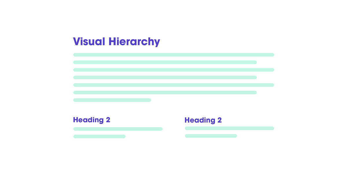
Fig 2.2 Example template of visual hierarchy using different headings
3. Don't reinvent the wheel
We believe people want something new and more. But we forget that there are many applications in the market that demands our time. Each application has different interactions, and we need to learn by one by one.
It's an important point to know before I'm going to say this:
when we are asked to design somethingnew, we have a temptation to try and reinvent the wheel. Because doing something like other people has done seems wrong. We have been hired to do something different.
"Before reinventing the wheel, you have to understand the value (time, effort, knowledge) that went into what you are trying to disrupt and innovate"
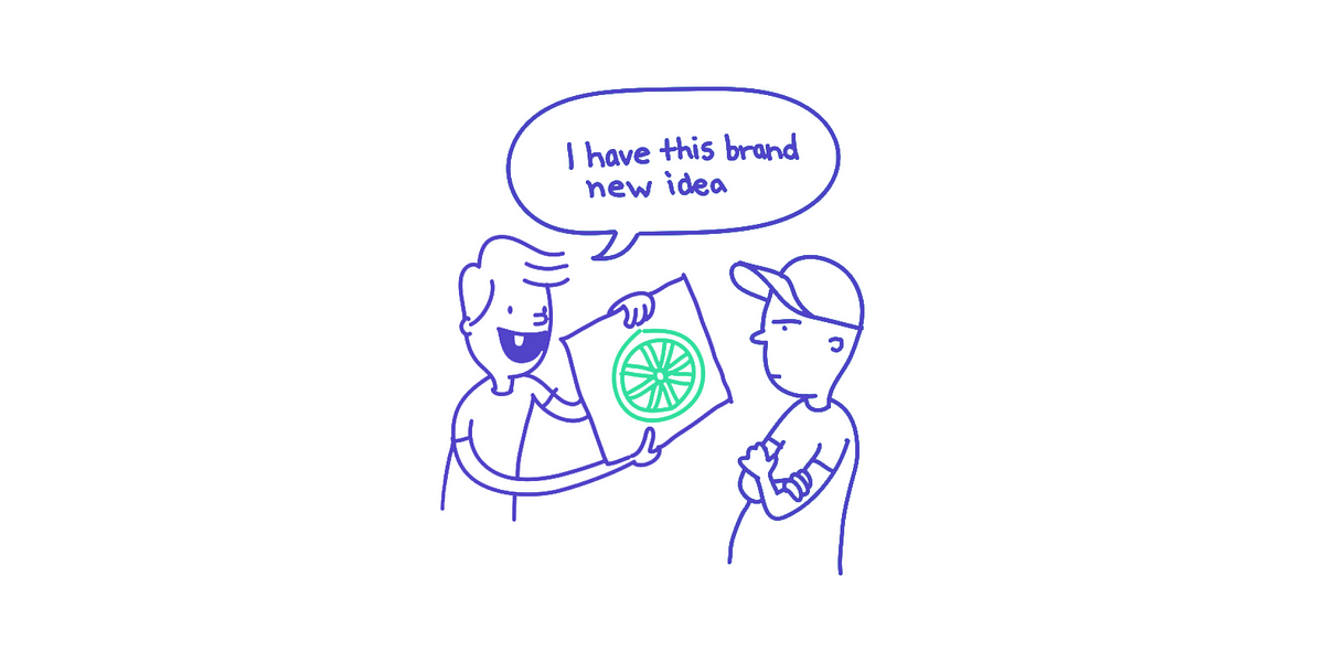
Fig 2.3 Scenario of reinventing the wheel
4. Product instructions must die
Our job is to make things clear and obvious. We should actually aim to remove these instructions to make everything self-explanatory. But when they are necessary.
For example, IKEA products. They used images as instructions to show clearly how the product should assemble at each step. No words are written at all.
5. We don't care how your product works
To most people, it is not important to know or understand how the product works. They merely do not care at all. But once we know the use of the product, they will rarely switch to something else.
6. People don't look for "subtle cues" - we are in a hurry
We, designers usually give users subtle effects and add beautiful delights to our products. But users don't care about this.
7. Focus groups are not usability tests
Focus group is a small group of people that sit together and discuss things. They talk about their opinions about the product, past experience, their feelings and reactions to new concepts. They are useful to determine what your audience wants.
A usability test is about watching one person trying to use something (your product). You ask them to perform certain actions to see if you need to fix in your concepts. Focus groups is about listening and usability tests are about watching.
8. We allow personal feelings take over the process
We, designers tend to think that most users are like us. Hence, we think that users will like our product if we like it as well.
9. You ask the wrong questions
It is not productive and will not add value if you ask questions like: "Do people like drop-down menus?" The correct way to ask is: "Does this drop-down menu, with these words, in this context, on this page create a good experience for people who are likely to use the site? We should focus deeper to the strategic context of the design.
10. When a person uses your product, you forget that that person shouldn't spend time thinking about...
- Where am I?
- Where should I begin?
- What are the most important things on this page?
- Why did they call it that way?
- Is that an ad or part of the site?
Every question that pops in our head, when using your product, only adds to the cognitive workload. It distracts our attention from "why I am here" and "what I need to do". And as a rule, people don't enjoy solving puzzles when they merely want to know if the button is clickable.
In conclusion, this article help me to take note of these common mistakes made by designers and how I should ask questions on my product in a strategic way that will make users' life better and easier.
Reference List: Esanu, E. (2019). 10 Small Design Mistakes We Still Make. [online] UX Planet. Available at: https://uxplanet.org/10-small-design-mistakes-we-still-make-1cd5f60bc708 [Accessed 28 Jun. 2019].

Comments
Post a Comment