INTERACTIVE DESIGN- PROJECT 2

23/5/19 - 6/6/19 (Week 8 - Week 10)
Andrea Vie Choong Jia Qi (0331945)
Interactive Design
Project 2
Typosexual Typographic Exhibition - Microsite
_______________________________________________________________
LECTURES
Lecture 7:-
23/5/19 (Week 8)
We had no lecture this week as we continued with our exercise 4 and moving on to sketching our wireframes for project 2.
Lecture 8: Bookstap
30/5/19 (Week 9)
This week, we were introduced to Bootstap where we briefly learned how to use and how we can apply this to our project 2 as well. I learned about the grid system used in Bootstrap.
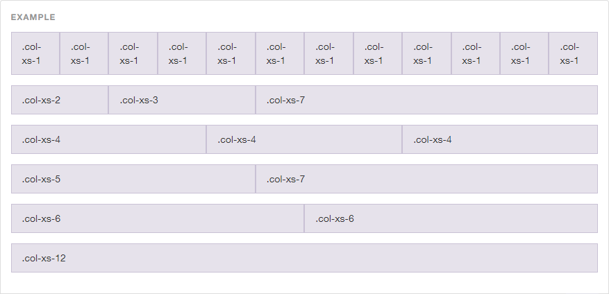
Fig 1.1 Example of grid system in Bootstrap
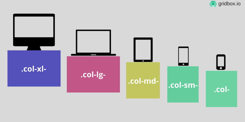
Fig 1.2 A diagram of what each grid is used for
__________________________________________________________
Lecture 9: -
6/6/19 (Week 10)
We had no lecture this week as we had a public holiday and it is a e-learning week. We continued receiving feedback on our project 2 progress.
Lecture 10: -
13/6/19 (Week 11)
We had no lecture this week as we had a public holiday and it is a e-learning week. We continued with our project 2.
INSTRUCTIONS
Module Information Booklet (MIB)
_______________________________________________________________
PROJECT 2
Typosexual Typographic Exhibition - Microsite (Week 8 - Week 10)
23/5/19 (Week 8)
For this project, we are asked to design a microsite on "The Troublemakers Manifesto: A Design Colloquium". We have to do it in one page and it has to include our collateral that we made for Advanced Typography project 2. The purpose of the microsite is to invite people to come to the colloquium.
I started off by sketching several wireframes to plan out layouts of the microsite on paper. I also searched for references in Pinterest to give me some ideas on how to layout each section.
Here is the link to my references/inspirations in Pinterest:
https://www.pinterest.com/achoong2001/microsite-for-the-troublemakers-manifesto/


Fig 1.3 Wireframes (Idea 1-4)
I created mood boards to select the colours or patterns I want to use in my microsite as well as some site layout as a guide to help me when I start to design on my own.

Fig 1.4 Mood Board (Colour Scheme, Texture, Font, Social Media Icons)

Fig 1.4 Mood Board (Content, Navigation, Logo)

Fig 1.5 Mood Board (layout samples-wireframe)
30/5/19 (Week 9)
This week, I finalized my chosen wireframe which will be Idea 4 and Idea 1 for the top navigation bar that I will use for my microsite layout and start doing using the bootstrap sample and use it in Dreamweaver.
I did the mircosite layout in Illustrator (AI) to test out how my website will look like as an actual result.

Fig 1.6 Mockup (Static)


Fig 1.7 Mockup (Hover Effect)
Here is the chosen bootstrap sample that I will go ahead with.
https://getbootstrap.com/docs/4.3/examples/carousel/
6/6/19 (Week 10)
This week, I added the content in the carousel bootstrap by designed it in Canva and changed according to the microsite I created in the previous week.

Fig 1.8 Progress of designing slides for carousel using Canva

Fig 1.9 HTML Progress (Dreamweaver)

Fig 1.10 CSS Progress (Dreamweaver)
This week, I had to align my website properly and add organized my codes accordingly to separate sections so I do not get confused on which part I am editing. I also learned how to include buttons in the carousel as well.
13/6/19 (Week 11)
After completing the microsite, I previewed the site in HTML and CSS in PDF. For the HTML, I could not save the codes from Dreamweaver as some codes were cut off so I saved it from the google chrome browser.
Fig 1.11 Embedded PDF of HTML (Final)
Fig 1.12 Embedded PDF of CSS (Final)
HOME- CAROUSEL SLIDER

Fig 1.13 Home Section- Carousel Slider 1 (1st attempt)

Fig 1.14 Home Section- Carousel Slider 2 (1st attempt)

Fig 1.15 Home Section- Carousel Slider 3 (1st attempt)
ABOUT

Fig 1.16 About Section- What is Troublemakers Manifesto (1st attempt)
EVENT

Fig 1.17 Event Section- Featuring Our Guest Speakers (1st attempt)
SHOP

Fig 1.18 Shop Section- Our Merchandise (1st attempt)
CONTACT

Fig 1.19 Contact Section- Feel Free To Reach Us (1st attempt)
After receiving feedback, I adjusted my micro site further by refining the images so they don't look distorted and adjust the container and row to make it responsive and aligned.
HOME

Fig 1.20 Home Section- Carousel Slider 1 (Final)

Fig 1.21 Home Section- Carousel Slider 2 (Final)

Fig 1.22 Home Section- Carousel Slider 3 (Final)
ABOUT

Fig 1.23 About Section- What is Troublemakers Manifesto (Final)
EVENT

Fig 1.24 Event Section- Featuring Our Guest Speakers (Final)
SHOP

Fig 1.25 Shop Section- Our Merchandise (Final)
CONTACT

Fig 1.26 Contact Section- Feel Free To Reach Us (Final)
https://andreaviechoong.000webhostapp.com/interactive_design/project_2/index.html
__________________________________________________________
FEEDBACK
23/5/19 (Week 8)
There was no feedback given this week.
30/5/19 (Week 9)
General feedback: Mr. Shamsul said we can either use the HTML & CSS we learned in Dreamweaver for our exercises or try using the bootstrap for a more better responsive site.
Specific feedback: For my exercise 4, Mr. Shamsul said I have to change the background image or the container colour to use only either image/colour as a background as it looks very distracting. But overall, the site layout looks clean.
6/6/19 (Week 10)
Online feedback: Fonts choice is not suitable because you link it in your website. Better to use from Google fonts. You need to do your own wireframe.
13/6/19 (Week 11)
I did not receive any feedback this week.
20/6/19 (Week 12)
Specific feedback: Mr. Shamsul told me to adjust the images so that they do not look distorted. Align each section to each one by adjusted the margin and padding. Change the navigation bar to a hamburger menu when the screen gets smaller. He told me one of the social media icon is missing and update it.
REFLECTION
EXPERIENCES
23/5/19 (Week 8)
While I was searching for references online in Pinterest or Google, it gave me inspiration and more ideas to think about while sketching the wireframes for the microsite. I knew that this project was not easy as now we are designing the movement and interaction of the page instead of a static one like project 1.
30/5/19 (Week 9)
I learned about the grid system that can be useful and applied in the bootstrap examples and it is easier to plan out the sections for the content and images and it would look more cleaner.
6/6/19 (Week 10)
I learned how to add different components from bootstrap instead of using an exisiting template in the examples given. It is much easier for me to build the layout rather than using the existing one.
13/6/19 (Week 11)
It was more a less stressful week as I just continued to align for each section and learned to input a button in the carousel.
OBSERVATIONS
23/5/19 (Week 8)
I saw how different designers design their websites in their own unique styles and some of them looks really appealing to me and it gave me some idea on how to design sites that attracts people especially for this topic about inviting people to come to the colloquium.
30/5/19 (Week 9)
I saw how there were many different layouts of websites that we can choose from that looks similar to the design of layout we plan to use. It was actually much easier using bootstrap as it is responsive to the screen size and we can customize the template without having to do from scratch.
6/6/19 (Week 10)
I watched some tutorials on how to edit using bootstrap and it was actually much easier than doing it manually in HTML and CSS in Dreamweaver.
13/6/19 (Week 11)
I saw how my other classmates made their website using bootstrap.
FINDINGS
23/5/19 (Week 8)
I found that designing wireframes is actually useful as it plans out how the site will look like as a result as it acts as a trial and error. We can analyze how the site will be lay out and test it out as a user before designing the actual one in the software.
30/5/19 (Week 9)
I found how to add different components into the bootstrap easily by the demo examples given the bootstrap website.
6/6/19 (Week 10)
I found how to add a carousel in many ways as I always wanted to try out this effect and element.
13/6/19 (Week 11)
I found out how to add buttons in carousel using the carousel caption and adjust the size and position in CSS.
FURTHER READINGS
Classification Schemes (and When to Use Them) by Donna Spencer
Week 10
When I was scrolling through several articles in UX design, I came across this article about information architecture where it talks about how information can be categorized or classified in order to make your content organized.
Here are the different classification schemes and tips on when and how to use each of them.
1. Alphabetic
This scheme is used for any type of information as long as there is a name that includes in a A-Z scheme. Alphabetic schemes is often works best when people know what they are looking for, know how to describe it and the item labeling matches the words they are looking for.
For instance, dictionaries and glossaries uses this scheme. User research is a good input into an A-Z as it is a rich resource of terminology people use.

Fig 3.1 BBC A-Z index
Geographical schemes can be used for any content with some sort of geography as a key attribute. This scheme is useful in these two criteria. Firstly, your audience would want to access information in that way. And secondly, they must understand the geography you are using in detail.
One thing to consider when using this scheme is the difference between using a map to display information and a map to navigate to it. Geography can be good as a secondary way to access information.

Fig 3.2 Last.fm shows events in the user's local area
A format schema organizes content around the format of the file. This is common on sites like instructional websites and article websites. Basically, it is to organize the content on what your audience expects and wants to find it like that. It is a great method to show people a variety of information available once they found the topic.

Fig 3.3 Bunnings has a DIY section organized by format of the content
This scheme can be found in both intranet and websites. It is easy for authors as tehy prepare information and put it in "their" part of the site. The main problem with this scheme is anyone who needs the information needs to know who is responsible for it. This is a bad way of organizing information.
5. Task
Task-based schemes are interesting. This scheme works best when there are only a small set of tasks, main tasks have quite clear boundaries, and your content is easy to allocate to the task groups. It is more suited to web applications than websites or intranets.

Fig 3.4 Paypal's second level navigation is task-based
This scheme like task-based schemes. It is used when you need to split your audience into groups with clear boundaries and identify which group they belong to. Your content assigns across audience groups without too much overlap.

Fig 3.5 Dell use an audience scheme as the top level of the site
7. Subject/Topic
This scheme is most often used. A subject scheme groups similar things together based on what they are about.
8. Combination schemes
You can also use the combination scheme which you use all the schemes mentioned above. It uses more than one approach for your whole content set.
In sum, there is no hard and fast rules. Choosing the suitable scheme depends on whether it works well for your audience, whether they expect to access information this way and it works well for your content.
Reference List: Spencer, D. (2010). Classification Schemes (and When to Use Them) | UX Booth. [online] Uxbooth.com. Available at: https://www.uxbooth.com/articles/classification-schemes-and-when-to-use-them/ [Accessed 6 Jun. 2019].

Comments
Post a Comment