INTERACTIVE DESIGN- PROJECT 1

18/4/19 - 2/5/19 (Week 3- Week 5)
Andrea Vie Choong Jia Qi (0331945)
Interactive Design
Project 1
Static Landing Page
_______________________________________________________________
LECTURES
Lecture 3: Introduction to the language of Web
18/4/19 (Week 3)
We learned about the establishment of web and what are the terms used when designing a website. We also discuss the differences between web and internet. World Wide Web Consortium (W3C) is created to help web standards.
_______________________________________________________________
INSTRUCTIONS
Module Information Booklet (MIB)
_______________________________________________________________
PROJECT 1
Static Landing Page (Week 3 - Week 5)
18/4/19 (Week 3)
We had to do a web landing page based on our interest. We started off by choosing our topic, target audience and purpose of the website.
I chose to do on a french cafe, Patisserrie Boutique in Ipoh. I chose to do on this cafe because this cafe does not have a proper website to promote it so I decided to create one for them.

Fig 2.1 Notes/Ideas for landing page


Fig 2.2 Wireframing ideas
And I chose a specific colour scheme that matches with the cafe colours.

Fig 2.3 Mood Board & Colour Palette
I searched for some good landing pages as references. I also compiled references for each section in the landing page.


Fig 2.4 References for the landing page from several websites


Fig 2.7 https://www.quay.com.au/

Fig 2.8 http://supersaigon.com.my/

Fig 2.9 https://thegoodco.my/
After that I designed my chosen idea digitally in Illustrator. I referred to my references from the websites I found as the guide for the aesthetic purpose and layout. I decided to do the landing page in separate artboards to make it easier to focus on one design.

Fig 2.10 Process of designing landing page- 1st attempt

Fig 2.11 Overview of the landing page- 1st attempt (in separate sections)

Fig 2.12 Initial Landing Page

Fig 2.13 Process of designing landing page- final attempt

Fig 2.14 Overview of landing page- final attempt

Fig 2.15 Final Landing Page
And after the landing page is completed, I added the navigation menu and a hover effect shown on the navigation menu.


Fig 2.16 Left: Landing Page (Navigation Menu) & Right: Landing Page (Hover Effect on Menu Navigation)
____________________________________________________________________________
FEEDBACK
18/4/19 (Week 3)
Specific feedback: Mr. Shamsul approved on my idea of creating a website to promote a cafe. He gave a recommendation that I could add icons that allows users to buy the food online for example like food panda.
24/4/19 (Week 4)
Specific feedback: Mr Shamsul commented that the alignment of my text and image is not organized. The colour of text should be readable He suggested to place the menu and search bar to the right and logo on the left. Besides that, the social media icons is better to be place at the bottom. He advised me to use a modern typeface preferably sans-serif font.
REFLECTIONS
EXPERIENCES
18/4/19 (Week 3)
I felt that I enjoyed this project more because I get to design something with my interests.
24/4/19 (Week 4)
It was fun to exploring different layout and colours for the landing page while designing it in Illustrator.
OBSERVATIONS
18/4/19 (Week 3)
I looked out several landing pages in websites related to restaurants and cafes. They have their own unique way of presenting and promoting their business.
24/4/19 (Week 4)
I saw how alignment is important in websites as it shows organization and a clean presentation.
FINDINGS
18/4/19 (Week 3)
While reading about the importance of button elements in websites, I found out that buttons can improve the user experience and easier for users to locate the information they want.
24/4/19 (Week 4)
I found that choosing the appropriate typeface which relates to the style of the cafe or restaurant is to be considered.
FURTHER READINGS
UX Planet- Button UX Design: Best Practices, Types and State by Nick Babich
Week 3
While scrolling through the website, I came across an article on the buttons in user experience design. I learned that buttons are basic element of interaction design. It creates a conversational flow in web and applications. The more effective the buttons are, it improves the user experience.
How to make the buttons?
1. Use shape and colour
2. Suitable size and padding
3. Location & order
4. Labels
5. Call to action
There are also different buttons types to use:
1. Raised button: give more importance to actions in layouts with lots of varying content.

Fig 3.1 Example of raised button used
2. Flat button: unify button action with dialog content

Fig 3.2 Example of flat button used
3. Toggle button: used in group related options
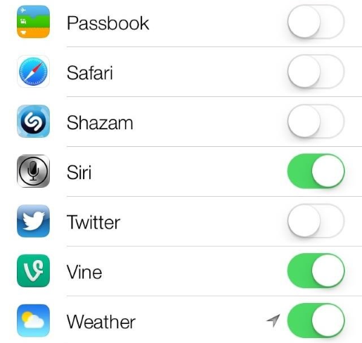
Fig 3.3 Example of toggle button used
4. Ghost button: used for secondary or tertiary content

Fig 3.4 Example of ghost button used
5. Floating Action button: used for promoted action

Fig 3.5 Example of floating action button used
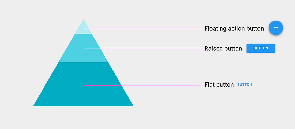
Fig 3.6 Button type selection suggested by Google Material Design
Reference List: UX Planet. (2019). Button UX Design: Best Practices, Types and States. [online] Available at: https://uxplanet.org/button-ux-design-best-practices-types-and-states-647cf4ae0fc6 [Accessed 18 Apr. 2019].

Comments
Post a Comment