ADVANCED TYPOGRAPHY- PROJECT 1

7/5/19 - 21/5/19 (Week 6- Week 8)
Andrea Vie Choong Jia Qi (0331945)
Advanced Typography
Project 1
The Troublemakers Manifesto: A Design Colloquium- Title & Key Artwork
_______________________________________________________________
LECTURES
Lecture 6: Finding Inspiration-Typeface Design
7/5/19 (Week 6)
This week, my group members and I presented on a lecture, Finding Inspiration: Typeface Design.
From this lecture topic and while I was researching, I found that designers create typefaces from anything in our everyday lives. It is also how we are eager and determine to experiment with different medium or objects. But it includes the functionality aspect as well. I learned that each designer has their own way of experimenting and creating their own typeface. It also helped with broadening my thinking and ideas when I was struggling with the 3rd exercise on creating a Type & Play (Part 2) poster.
Lecture 7: Designing Type- Thinking Before Drawing
14/5/19 (Week 7)
We had a lecture on Designing Type: Thinking Before Drawing.
From this lecture, I learned that a design brief is important because it gives a clear vision of the purpose of the task. Besides that, it also asks questions and we gain answers that we want to find.
Other than the design brief, I was recalled of what I have learned during my Typography class in semester 1. For example, the letter construction is what we used and did for our Typography project 2. Basically, all these characteristics is essential to make up different letter forms and categorize them into different type families. It would be usually when I need to design a typeface or refer to a typeface for any exercises or projects I do.
_____________________________________________________________________________
INSTRUCTIONS
Module Information Booklet (MIB)
_______________________________________________________________
PROJECT 1
The Troublemakers Manifesto: A Design Colloquium- Title & Key Artwork (Week 6 - Week 8)
7/5/19 (Week 6)
We started this project by looking for an appropriate image or visual as a key artwork or signature artwork to represent or connect on "The Troublemakers Manifesto: A Design Colloquium" with the provided meaning of the event given in the MIB. We are advised to apply what we learned in our previous exercises.
This is the meaning behind "The Troublemakers Manifesto: A Design Colloquium"
I looked for some references of designers' designs and works in Pinterest and Google.


Fig 1.2 References


Fig 1.2 Images #1

Fig 1.3 Removing background from image in PS
Then I interplay the key artwork with the title. I used the Gill Sans MT as my chosen typeface.
I used the dilatational system for the arrangement of the text for "design colloquium". The rest of the text is by playing around with the flow of the people's action. I added the paintbrush to replace the stick that the high jumper jumps over because paintbrush is one of the essential tool for a designer.

Fig 1.4 Composition #1 (B&W)
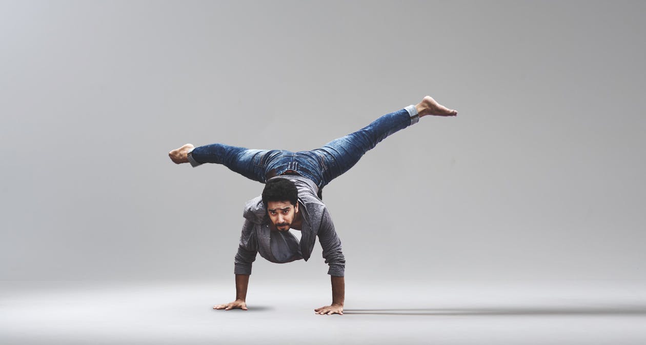
Fig 1.5 Image #2

Fig 1.6 Removing background from image in PS
For this composition, I used the grid/modular system on the "A design colloquium and the rest is designed with the flow of the person's action.

Fig 1.7 Composition #2 (B&W)
I also found that troublemakers have a trait of being ambitious and impulsive. So I looked for an image as a key artwork to represent this trait. I came across an image of someone doing rock climbing may represent being ambitious.

Fig 1.6 Image #3

Fig 1.7 Removing background from image in PS
I used the axial system for the text composition on the rock silhouette and the flow of text follows the flow of the people's actions.

Fig 1.8 Composition #3 (B&W)


Fig 1.21 Embedded PDF of Final Artwork- Coloured
 Fig 1.22 Final Artwork- Black & White
After getting feedback from my three previous compositions, I had to relate the image to the creative people. So I tried out more ideas and read the meaning of the event again and again to understand the hidden meaning better and clearer. This time, I focus on making the key artwork first before adding the text.
I chose the boy with the straw glasses and magnify glass images to show the mischievous personality in him. I added the red and white tape around the drink to show that we have to be cautious around this boy.
Fig 1.9 Images #4

Fig 1.10 Composition #4 (Coloured)
While thinking about creative types of people, I thought of artists. So I looked for some artist images that best express trouble making painting. So I came across this image of a Japanese artist that paints on a blank wall using the Japanese calligraphy technique. I added some silhouette of people and made them smaller than the artist because troublemakers tend to stand out more than other people.

Fig 1.11 Images #5

Fig 1.12 Composition #5
After that, I came across another idea of using a protester to represent the troublemakers. I was also inspired on one of the illustration that might help with my composition. I wanted to show how a designer is a troublemaker by its protesting mind. I also found that a clown's red nose can represent trouble as well.

Fig 1.13 Reference


Fig 1.14 Images #6

Fig 1.15 Composition #6 (1st attempt)
After receiving feedback, I had to explore more in terms of the composition. I started to play and explore with the word "makers" around the clown-like human and silhouette.

Fig 1.16 Composition #6 (2nd attempt)

Fig 1.17 Composition #6 (3rd attempt)

Fig 1.18 Composition #6 (4th attempt)
I choose to go ahead with the 4th attempt of composition #6. I had to make the title "Troublemakers Manifesto" more readable. So I ask some of my friends that are not designers, they say it is diffcult to read the "Troublemakers" and it is too scattered. One of my friends suggest that I could put the letters "TROU" to the left and "BLE" on the right and leave the "makers" in the middle.

Fig 1.19 Composition #6 (5th attempt)
When I made my poster in project 2, I was asked to changed the exclamation mark stroke to a more soften brush. After that, I changed the artwork to black and white as well since we need to submit it as our finalized work.

Fig 1.20 Final Artwork- Coloured
Fig 1.21 Embedded PDF of Final Artwork- Coloured

Fig 1.23 Embedded PDF of Final Artwork- Black & White
_________________________________________________________
FEEDBACK
7/5/19 (Week 6)
14/5/19 (Week 7)
General feedback: Mr. Vinod said to move away from the western culture and focus more towards the Asian culture that will make your work original. He also advised us to read more books so that it broadens our ideas.
Specific feedback: Mr. Vinod commented that the interplay is alright but the key artwork should be related to creative people instead of athletes or dancers. He agreed with my interpretation of what troublemakers is but it needs to relate to designers.
20/5/19 (Week 8)
Online feedback (Mr.Vinod): Ok la. You wanna explore the use of the clown a little more? I mean explore the use some more in terms of composition.
Specific feedback: Mr. Vinod said to try out one more different composition in one hour then continue to the poster design.
_____________________________________________________________________________________________
REFLECTIONS
EXPERIENCES
7/5/19 (Week 6)
It was difficult at first to find an appropriate image that has a connection or interpretation to the content or text provided. But now, I learned how to interpret the text especially the word "troublemakers" to something visual.
14/5/19 (Week 7)
I took some time to search of what creative types of people is and how it relates to designers. I had some difficulties again trying to find something to represent the word "troublemakers" as a key artwork.
OBSERVATIONS
7/5/19 (Week 6)
I saw how other designers and some of our seniors' work on how they interplay with the content and visual images to create a signature or key artwork. It was really cool and satisfying to see.
14/5/19 (Week 7)
I observed carefully at my seniors' work and some of my course mates on how they made their key artwork relating to troublemakers.
FINDINGS
7/5/19 (Week 6)
I found that I have a weakness in creating the suitable interplay between my text and image. I sometimes tend to focus on the creativity and exploration part but not at the functionality.
14/5/19 (Week 7)
I found how troublemakers can be interpret in different ways such as in humans, objects or even animals but the exception it needs to relate to a designer. However, it is important of how we present that image as a key artwork of "troublemakers".
FURTHER READINGS
Virtual Typography by Matthias Hillner
Week 6

Fig 2.1 Book Cover
Chapter: The borderline between image and text
While browsing the books in the Taylor's library catalogue relating to typography, I came across an interesting book about virtual typography. It talks about kinetic and motion typography which I never heard about it.
Kinetic Typography
This type of typography is evolved from the design of film titles. So it is mostly used in screen-based media. The literal meaning of kinetic typography is "the art of print in motion". The printing of type uses text on paper, on a wall or on an object. The text cannot be moved.
But the carrying material is moving. For example, a car covered in advertising or pages of a book. The reader also moves with the text like when passing a billboard or traffic sign. However, the text would be interpreted as static than kinetic in these cases. Motion is generally identified in relation to its context.
Motion Typography
It is also often used for screen-based communication. Type can be set to move across the screen, the screen borders is the point of reference. A viewer would interpret the typography as motion typography. For a designer's perspective, any typographic information that changes over time is considered in motion.
Example: Time-based logotype
Fig 2.1 Image of process of the logo animation
In the end, the circular shape transform into the symbol that represents the institution. The typographic treatment was inspired by Richard Greenberg's title sequence for the film, Altered States in 1980.
Reference List: Hillner, M. (2009). Virtual Typography. Retrieved from https://www.researchgate.net/publication/308942509

Comments
Post a Comment