ADVANCED TYPOGRAPHY- PROJECT 2

21/5/19 - 28/5/19 (Week 8- Week 9)
Andrea Vie Choong Jia Qi (0331945)
Advanced Typography
Project 2
The Troublemakers Manifesto: A Design Colloquium- Collateral
_______________________________________________________________
LECTURES
Lecture 8: -
21/5/19 (Week 8)
We had no lecture this week as we continue with our key artwork and starting to design our poster as one of the collateral.
Lecture 9: -
28/5/19 (Week 9)
We had no lecture this week as we continued with our collateral design for poster, shirt and a chosen collateral of our choice, drawstring bag.
_______________________________________________________________
INSTRUCTIONS
Module Information Booklet (MIB)
_______________________________________________________________
PROJECT 2
The Troublemakers Manifesto: A Design Colloquium- Collateral (Week 8 - Week 9)
21/5/19 (Week 8)
After finalizing the key artwork and title, I moved on to designing the poster by adding in the details of the event.
Here is the information of the event details given in the Facebook group:
The Design School,
Taylor’s University
The Troublemakers Manifesto: A Design Colloquium
Open Public Lectures:
November 8, 2019
1030–1100 Ms Liew Pik-Svonn
1105–1135 Ms Ezrena Marwan
1140–1210 Mr Muthu Nedumaran
1400–1430 Ms Suzy Sulaiman
1435–1505 YB Ahmad Fahmi Fadzil
1525–1700 Panel discussion
Lecture Theatre 12
Here is the key artwork & title that I made in project 1 and I will be used it for each of my collateral.

Fig 1.1 Final Outcome- Key Artwork & Title (Black & White)

Fig 1.2 Final Outcome- Key Artwork & Title (Coloured)
COLLATERAL: POSTER #1
I explored different kinds of layout for the event details by using some of the typographic systems that I previously learned in exercise 1. It helps as a guideline and starting point for my layout design of the poster.

Fig 1.3 Progress of poster design in AI

Fig 1.4 Composition #1

Fig 1.5 Composition #2

Fig 1.6 Composition #3

Fig 1.7 Composition #4
After getting feedback, Mr.Vinod said that the second composition looks interesting but I have to make sure the title "Troublemakers Manifesto" is readable to people who don't know about this event. I decided to go ahead with the composition and modify further.

Fig 1.8 Collateral- Poster (1st attempt)
After the feedback, I had to change the brush style of the exclamation mark stroke I drew at the back to a softer brush as it looks too harsh. After that, I am able to start printing the poster and framing it.

Fig 1.9 Final Poster- Black & White

Fig 1.10 Final Poster- Coloured
Fig 1.11 Embedded PDF of Final Poster- Coloured
After finalizing the design of the poster, I printed the poster in A2 size and place it in a frame (50 x 70 cm).

Fig 1.12 Framed Poster (50x70cm)
Besides the poster, I had to make a T-shirt and one more collateral from our own choice. I brainstorm for several collateral that I can print on.
- book cover
- drawstring bag
- tote bag
- key chain
- luggage tag
- mug
- bookmark
- coaster
- badge
- phone case
I decided to go ahead and design on a non-woven bag.
28/5/19 (Week 9)
I tried out different compositions using a sample template to see how it looks as a result.

Fig 1.13 Process of designing artwork on T-shirt in AI

Fig 1.14 Composition #1- Front & Back

Fig 1.15 Composition #2- Front & Back

Fig 1.16 Composition #3- Front & Back
After the feedback, Mr. Shamsul suggested to go with either the first or third composition. I chose to go ahead with the third idea and modify it a little.
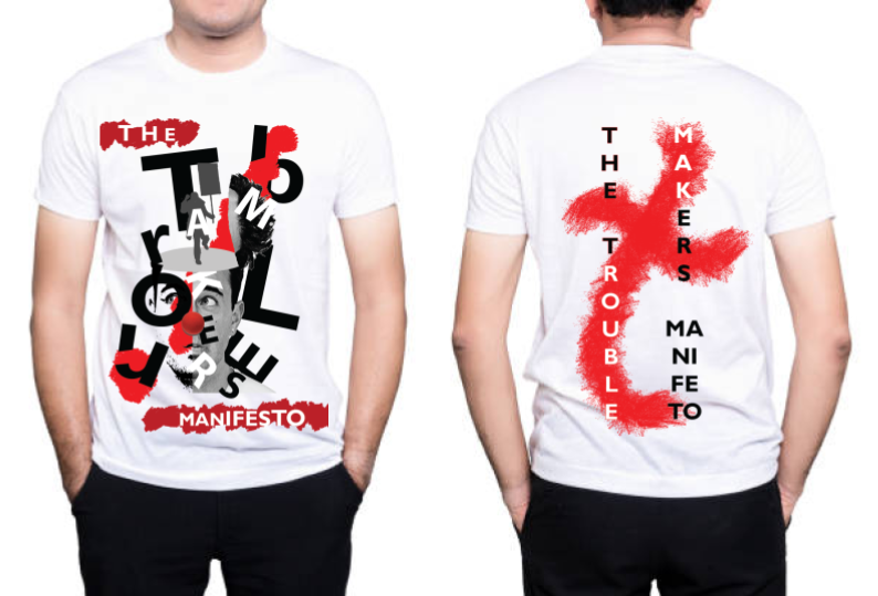
Fig 1.17 Final Design of Collateral- T-shirt
Fig 1.18 Embedded PDF of Final T-shirt Design (Front & Back)
4/6/19 (Week 10)
After finalizing my design of my shirt, I printed in on a microfiber material for both front and back. I tested on a user to see how it looks as a result.

Fig 1.19 Testing on a user: T-Shirt- Front

Fig 1.20 Testing on a user: T-Shirt- Back
28/5/19 (Week 9)
COLLATERAL #3: DRAWSTRING BAG
I tried out different compositions using a picture of a non-woven sample bag that I found online to see the results.

Fig 1.21 Process of designing artwork on the bag


Fig 1.22 Design Idea #1

Fig 1.23 Design Idea #2
After the feedback given, Mr. Shamsul said the design was not good enough and develop it further. So I decided to incorporate my first design of my shirt and changed it a little to make another design for the bag.

I noticed that the printing for the bag does not have a back printing so I added the words "The" and "Manifesto".


Fig 1.24 Design Idea #4
I noticed that the printing for the bag does not have a back printing so I added the words "The" and "Manifesto".

Fig 1.25 Final Design of Collateral- Non-Woven Bag
Fig 1.26 Embedded PDF of Final Non-Woven Bag Design (Front)
4/6/19 (Week 10)
After finalizing the design and printed it on an actual bag, I tested it on a user to see the results of the appearance.

Fig 1.27 Testing on a user: Non-woven bag (Front)
30/5/19 (Week 9)
COLLATERAL #4: MICROSITE
For our project 2 in Interactive Design, we made a microsite relating to our topic, The Troublemakers Manifesto from Advanced Typography project 1 and 2.

Fig 1.28 Final Microsite
Fig 1.29 Embedded PDF of Final Microsite

Fig 1.30 Flat Lay-
Left: Key Artwork, Poster, Middle: T-Shirt, Non-Woven Bag and Right: Microsite
Fig 1.31 Embedded PDF Flat Lay-
Left: Key Artwork, Poster, Middle: T-Shirt, Non-Woven Bag and Right: Microsite
FEEDBACK
21/5/19 (Week 8)
General feedback: Mr. Vinod said that we need to choose two more collateral to print out other than the poster. He also advised us to finish our collateral by next week, Week 9 so we can start on our final project which requires more time to work on.
Online Feedback (Mr.Vinod) Collateral 1-Poster: Looks interesting BUT “troublemakers manifesto” as a title might be a little too difficult to read. Did you test it out on someone who doesn’t know what you are doing? If no, you should to see if they can decipher it. For my two other collateral : Should be once you resolve the issue.
28/5/19 (Week 9)
General feedback: Mr.Vinod said to make sure we test on other people who are not designers to see whether they can read the poster properly.
Specific feedback: Mr.Vinod said that to change the brush style of the exclamation mark behind the artwork to a more softer style of brush as the brush I used is too harsh. He gave me a link to choose the types of brushes online. For my collateral of the T-shirt and drawstring bag, Mr. Shamsul said that it could be more better for the designs on the bag and for the shirt, he suggest to go ahead with idea 1 or idea 3.
_______________________________________________________________
REFLECTION
EXPERIENCES
21/5/19 (Week 8)
28/5/19 (Week 9)
This week, I continued with designing on my two other collateral, the t-shirt and the drawstring bag. I felt it was more better to place my designs on samples that I can find online to know how it will look like as a result. For the final project, I realized that I struggle to find the purpose and problem that I want to solve even though I have some ideas of execution.
OBSERVATIONS
21/5/19 (Week 8)
I observed how my seniors did their exploration in their poster design and also how other designers design posters relating to various events. I saw that most of them used the typographic system that they learned during their exercises.
28/5/19 (Week 9)
I saw how some of my classmates and my seniors created their collateral which gave me some ideas on how to improve my design. While browsing online for some ideas on the final project, I saw there are many ways to create alphabets but it must be unique.
FINDINGS
21/5/19 (Week 8)
I found that the hierarchy and placement of the text is important and must be readable in order for people to know what the event is about. After asking my friends who are not studying in design, I found that my title on my key artwork is difficult to read especially the "Troublemakers". This made me realize that it is important to make sure that other people who are not designers are able to understand and know what the event is about.
28/5/19 (Week 9)
I found that collateral can be different from the poster but it has to remain impactful and powerful to the audience. And while I was researching for ideas of my final project, I found that many designers have create alphabets using different ways through experimenting which then creates a purpose as well.
_____________________________________________________________________________
FURTHER READINGS
The Importance of Typography, Part 1: Fonts Speak Louder Than Word by Vital Design
The Importance of Typography, Part 1: Fonts Speak Louder Than Word by Vital Design
Week 8 - Week 9
While searching for typography related books, I came across this article about the importance of typography. I found it interesting so I wanted to share what I have read and learned.
This article discuss about how fonts affect our everyday lives. Especially in their digital era, people are aware of typography, design and how the world looks around them. It shares five tips that help us understand fonts and why they are important.
1. Fonts vs. Typefaces
Font= grouping of typefaces that have similar characteristics.
Typeface= refers to an individual family member of that font.
For instance, Gotham has many typeface, but each falls within the primary font, Gotham. Each typeface is unique but they share the same font name.
*Knowing a variety of typefaces that you use will give a good foundation as you develop your digital presence.
Fig 2.1 Example given (Gotham)
2. Know the Big Players
Fig 2.2 Difference between Sans Serif & Serif
Serif= has a slight projection at the stroke end seen at the bottom of the letters. If you observe closer, some fonts have "little feet" on them. This allows our eyes to flow through sentences easily.
Sans serif= they don't have "feet" or serif. They are more modern, trendy and streamline. So they tend to be harder to read in smaller fonts.
Script= elegant, light and professional appeal. It is often used for wedding invites, diplomas or certificates. It is not recommended as body copy or used in small spaces.
Display= often seen in movie posters, newspapers, banners. It is intentionally used to grab attention or give emphasis. This is also not used in large quantities.
Hand Lettering= these fonts have hand rendered characteristics. Designers used this font because it add human element to the design that people can relate to.
3. The Art of Visual Language
Various fonts and typefaces have many meaning and character in the way they look. Choosing the suitable font is important as a font can change an intended message depending on how or where you use it.
Fig 2.3 Example of font used in the word "STOP"
The one on the left seems to be screaming at you while on the right is very timid, faint and almost weak.
Typography is the vehicle through which we communicate tone of voice, age, gender, emotion and can be manipulated. Visual characteristics of font do speak louder than words.
4. What's the Big Deal?
Does the choice of font matter? Do people notice when a bad font is selected? Does it dictate what people do?
Yes! Here is an example:
Fig 2.4 PepsiCo's orange juice brand, Tropicana Pure Florida Orange
In 2009, PepsiCo's popular orange juice brand, Tropicana Pure Florida Orange Juice had a major rebranding. The name "Tropicana" changed from its classic font to a hip, sans serif font in 2 months and the sales dropped 20%. It costed the brand lots of money.
5. Stick with What Works
From a brand view, stick with what works. Don't be too excited in changing because the times are changing. If you have a visual landscape that works, remain it. Don't change fonts and typefaces with no appropriate reason.
Reference List: Design, V. (2019). The Importance of Typography. [online] Vital Design. Available at: https://vtldesign.com/brand-development/graphic-design/importance-typography-part-1-fonts-speak-louder-words/ [Accessed 21 May 2019].

Comments
Post a Comment