ADVANCED TYPOGRAPHY- FINAL PROJECT

28/5/19 - 25/6/19 (Week 9- Week 13)
Andrea Vie Choong Jia Qi (0331945)
Advanced Typography
Final Project
Design, Exploration and Application
_______________________________________________________________
LECTURES
Lecture 10: -
3/6/19 (Week 10)
We had no lecture this week as it is an open-learning week and we continued to search for ideas on our final project and get feedback online.
Lecture 11: -
11/6/19 (Week 11)
This week, we had two lectures presented by our coursemates.
From this lecture, I learned how typography is used in different mediums. Firstly, I learned how typography looks different in a print and in a web form. Then I saw how typography can be created by anything in our everyday lives like strains of hair, kinetic movements, prism reflection, optical illusion, growing moss and many more. It does not have to be something tangible.
Here is another lecture on the perception and organization of typography.
From this lecture, I learned how the typeface, layout and content structure can affect the readability and aesthetic of the type. Most importantly, the form and content of the typography is essential as it shows how the typography is perceived by the audience. We can also use the design principle like gestalt to help design the type.
Lecture 12: -
18/6/19 (Week 12)
We had no lecture this week but we still continued with our progress for the final project.
Lecture 13: -
25/6/19 (Week 13)
We had no lecture this week as we continued with our final project.
INSTRUCTIONS
Module Information Booklet (MIB)
_______________________________________________________________
FINAL PROJECT
Design, Exploration & Application (Week 9 - Week 13)
28/5/19 (Week 9)
We were briefed on what is our final project about and we are free to choose any topic as long as it has a purpose or a problem to solve.
From this, I did some research and looked at other designers' experimental typography and listed down some ideas.
1. Alphabets made from strings
Purpose & reason: to teach children by interacting and constructing the letters themselves.
2. To transform the Braille alphabets to regular alphabets
Purpose & reason: to teach people about the alphabets that are used by the blind
3. To enhance the typeface used in Ipoh Heritage Trial floor symbol
Purpose & reason: to enhance & show a better representation of Ipoh's identity.
4. To enhance the typeface used in a cafe website
Purpose & reason: to create a better typeface that will suit with the website theme and concept.
5. To create a typeface using the Chinese temple construction symbols
Purpose & reason: to create appreciation of the construction of the temple
6. Improve a movie poster, Lion King
Purpose & reason: to enhance using the elements/concept of the Lion King to the movie typeface.
3/6/19 (Week 10)
After receiving feedback on my initial ideas, I had to include some visual reference for each idea. I decided to go ahead with Idea 3-5 like what Mr.Vinod suggested and included another idea that I just came to mind.
Here is the attached PDF of my ideas.
11/6/19 (Week 11)
After many thoughts, I decided to go ahead with Idea 3 as I was more interested in that idea at first. So I decided to develop that idea with more inspirations and references that will help me be clear of what I want to produce and achieve.
While the development of the typeface is based on Ipoh's heritage, I looked for images that best represents it. I have photos of some of the signifiance buildings that relates to heritage so I decided to study the structure and design of those buildings and what makes them considered to be the heritage of Ipoh.


From my observation, I found that most of these buildings have similar designs especially the pillars.

So I decided to use these designs when creating my typeface for the letters. I explore two different variations using the letter H. I used a sans-serif font, Arial as a guideline to build my letter.


While the development of the typeface is based on Ipoh's heritage, I looked for images that best represents it. I have photos of some of the signifiance buildings that relates to heritage so I decided to study the structure and design of those buildings and what makes them considered to be the heritage of Ipoh.

Fig 1.1 Dewan Bandaran Ipoh (Ipoh Town Hall & Old Post Office)

Fig 1.2 Birch Memorial Clock Tower

Fig 1.3 Mahkamah Tinggi Ipoh

Fig 1.4 Ipoh Railway Station

Fig 1.5 Similar design style found on the heritage buildings (indicated in red)
So I decided to use these designs when creating my typeface for the letters. I explore two different variations using the letter H. I used a sans-serif font, Arial as a guideline to build my letter.
Fig 1.6 Chosen typeface (Arial) as guideline to construct my letters

Fig 1.7 Two different variations of letter H
I decided to go ahead with the second variation as it looks more unique and suitable and show more of the representation of the Heritage buildings in Ipoh. I continue using this style to create some alphabets.
I did some sketches of the alphabets before doing it digital in Illustrator.


I did some sketches of the alphabets before doing it digital in Illustrator.


Fig 1.8 Left: Letter H- initial sketch, Right: Letters B, Z, R, Y, S, K, L, G- developing sketches

Fig 1.9 Second Variation: Letters A-F (1st attempt)

Fig 1.10 Second Variation: Letters G-L (1st attempt)
18/6/19 (Week 12)
After I received feedback, I had to refer to a normal Roman typeface especially for letter B and D. I had to refine and change the thickness of the lines on my letters by making it consistent. Besides that, I need to reduce the number of lines as it looks over complicated.

I observe at the building structures again to make sure I do not forget about implementing the design style to the letters. I reduced the number of lines and adjusted some parts of the letters to make it look similar and consistent with each other.


I made the animated GIF again with the new refined letters and changed the animated GIF a little bit by adding the transparent illustrated heritage building of the Ipoh Town Hall to reflect on the typeface and the word "Ipoh Heritage".


Fig 1.11 Another chosen Roman typeface (Bembo Regular)
I observe at the building structures again to make sure I do not forget about implementing the design style to the letters. I reduced the number of lines and adjusted some parts of the letters to make it look similar and consistent with each other.

Fig 1.12 Second Variation: Letters G, B, C, D, K, F (2nd attempt)
After refining some of the letters, it seems to look more better than the previous attempt. I continued to refine them further before finalizing with the other letters as well.

Fig 1.13 Process of arranging the alphabets A-Z in AI (3rd attempt)
25/6/19 (Week 13)
After the feedback, I refined my letters further in reducing more of the white lines and maintain consistency in each of the letters.

Fig 1.14 Final Outcome of Typeface: Alphabets A-Z
Fig 1.15 Embedded PDF of Final Outcome of Typeface: Alphabets A-Z

Fig 1.16 Final Outcome of Typeface: Ipoh Heritage
Fig 1.17 Embedded PDF of Final Outcome of Typeface: Ipoh Heritage
ANIMATED GIF of "Ipoh Heritage" typeface
18/6/19 (Week 12)
After designing the letters from A to Z, I decided to make a short animated GIF of how the Ipoh heritage building are made from the beginning with layers of concrete to a beautiful majestic white building. The night sky colour scheme is to show the contrast of the white building letters.
I looked for colour scheme that I will use in my animated GIF.
Fig 1.18 Colour Scheme for animated GIF
I made each frame in separate artboards in Illustrator and then export it to Photoshop to create a timeline for the short animated GIF.

Fig 1.19 Process of making artboard in AI (1st attempt)

Fig 1.20 Process of editing the timeline to create the animated GIF in PS (1st attempt)
I made the animated GIF again with the new refined letters and changed the animated GIF a little bit by adding the transparent illustrated heritage building of the Ipoh Town Hall to reflect on the typeface and the word "Ipoh Heritage".
Fig 1.21 Illustration of Ipoh's Town Hall

Fig 1.22 Process of creating artboards (in AI)

Fig 1.23 Process of editing timeline for animated GIF (in PS)

Fig 1.24 Animated GIF of "Ipoh Heritage" typeface (1st attempt)
I wanted to make the last frame which is the final outcome appear longer as that is the purpose of the animated GIF.

Fig 1.25 Animated GIF of "Ipoh Heritage" typeface (2nd attempt)
I noticed that the heritage looks staggered almost near the end of the GIF so I edited again and make the animation a little more slower.

Fig 1.26 Final Animated GIF of "Ipoh Heritage" typeface
FEEDBACK
4/6/19 (Week 10)
Online feedback (Mr.Vinod): 1,2,6 are out. For the rest I have think I need to see some samples of the existing before I can say anything. Please support your pitch with visuals. Otherwise you are expecting people to understand what’s in your head to be the same as what’s conjured in theirs.
11/6/19 (Week 11)
General feedback: Mr. Vinod told us to place our key artwork and collateral in a flay lay and post it in our e-portfolio and were told to show them in the next class. We need to remember that we must set the image of our work to JPEG not PNG. For the final project, we were told that we need to have a clear purpose, problem and solution on our ideas before proposing those ideas to them.
18/6/19 (Week 12)
General feedback: For our poster, we can either print in A2 size and then crop out the edges and place within the frame area or print exactly the same size of the frame and just stick on it. We need to print our poster a little thicker because the poster may crumple when pasting in the frame area. For those who have not print their other collateral, Mr. Vinod said to choose one to print instead of two.
Online feedback (Mr.Vinod): There are two major problems with your type face: The base construction (thick and thin strokes reflected here in your and the over complication of the lines). You compare your D and B to the construction of a normal roman face. You will see the discrepancy in your strokes (thick and thin). These are BASIC processes that were already taught when designing letters. If you did this, you would not make these silly mistakes. Second, the choice of complicating the letters with so many lines. I understand that you want it to reflect the building, but does it have to be so over done. Simplify it. OR design a typeface that is based around the different parts of the building, which would make it a very awkward looking typeface ... you should have explained these two options... with a few letters and then showed it to us. Not do all the letters. So much time wasted. Organised your time and be smart about it. Take a look at Rausha’s blog. Look at her process.
25/6/19 (Week 13)
General feedback: Mr. Vinod said to hang our poster on the wall and take a photo of it and for our shirt he said to ask someone to wear it and take a photo of it. He reminded us to place our key artwork, poster, shirt and one chosen collateral in flat lay and upload it to our blog. For the final project, he said to put our processes in the blog as soon as possible or else we would not have much time and don't leave it till the end to upload. He said to concentrate on finishing the final project by this week and final complication & reflection by this week so that we can submit everything on Week 14 straight away. And after our processes, we had to write a brief outline of our purpose, problem and solution to our final project idea. Specific feedback: Mr. Shamsul told me that my letters still look inconsistent in the strokes and maintain similar strokes in each letter. He said it is okay to imitate the structure of the buildings but just reduce the number of lines in the letters like maybe 3 boxes to a stroke to simplify it. He asked me for my application and he said it is okay to do an animated GIF.
2/7/19 (Week 14)
General feedback: We were told to open our blog/e-portfolio in a private browser and open all the links and PDFs files in there. We need to update our final works in the final compilation by this week and complete our reflections by writing it very honestly in our own opinions as well. For type&play part 1, we need to include the image of the subject we dissect our letters from in the final compilation as well.
REFLECTIONS
EXPERIENCES
28/5/19 (Week 9)
It was not easy at first to decide a topic and idea for this project as it is free for us to explore and find a purpose on why we decide that idea.
3/6/19 (Week 10)
This week, I had a whole week at home to think about which ideas interested me the most and I had to find visual references to support my purpose.
18/6/19 (Week 12)
I had to refine my alphabets again and simplify it more by reducing the white lines before I finalized my new design of the typeface. It was actually much easier when I referred to a typeface similar to my typeface.
It took time for me to refine the letters and to make them look similar to each other. But as I adjust it from time to time, it was easier for me to spot the mistakes and correct it.
11/6/19 (Week 11)
This week was kind of stressful for me as I was struggling to think of what could be my execution to develop the font of my chosen idea. But then, I got an idea from the photographs I have relating to Ipoh's heritage.
18/6/19 (Week 12)
25/6/19 (Week 13)
It took time for me to refine the letters and to make them look similar to each other. But as I adjust it from time to time, it was easier for me to spot the mistakes and correct it.
OBSERVATIONS
28/5/19 (Week 9)
I saw how other designers create their own typeface and how they develop it from start to the end.
3/6/19 (Week 10)
For idea 3, I went around the old town to look for the floor symbol and I saw many people did not acknowledge it and just step on it or ignore its existence.
11/6/19 (Week 11)
I saw many similarities in the architecture of the Ipoh heritage buildings and explored by making the letters using the features of the architecture design.
18/6/19 (Week 12)
I compared and observed how the thickness of the strokes of my designed typeface with the actual Roman typeface.
25/6/19 (Week 13)
I saw many real life examples of application to place the typeface online and I finally got an idea to apply my typeface on and how to express it from what I wrote from my purpose, problem and solution earlier in the slides.
28/5/19 (Week 9)
I found out how people get their inspirations for their works or projects and it also was not easy for them to find out why they decide to do that. And that is the difficult process when designing anything.
3/6/19 (Week 10)
I found out how designers came up with ideas with anything they deal with in their everyday lives not just coming up with ideas just like that in their head.
11/6/19 (Week 11)
I found out that I can gain more ideas if I start executing and exploring earlier and do it physically without thinking about it in my mind.
18/6/19 (Week 12)
From reading the article written in my further readings, I found out how people use different mediums and explore by manipulating the design elements until they are satisfied with the result. I know that the process of designing is very important to a designer as it shows how he/she came up with the initial idea and develop it into the final outcome.
From reading the article written in my further readings, I found out how people use different mediums and explore by manipulating the design elements until they are satisfied with the result. I know that the process of designing is very important to a designer as it shows how he/she came up with the initial idea and develop it into the final outcome.
25/6/19 (Week 13)
I found that we always need to refer to an existing typeface in order to guide us to the right track and it would be easier to use it when designing our own typeface.
I found that we always need to refer to an existing typeface in order to guide us to the right track and it would be easier to use it when designing our own typeface.
FURTHER READINGS
What is Experimental Typography? Trends and Examples by Madalin Tudose
Week 10 - Week 11
In this article, I learned about how designers use experimental typography through different methods and ways they have interpreted. They often design using various design elements and interfaces to make the outcome attractive. Most importantly, the application that they use for the outcome is what makes it creative.
1. Experimenting with Flair
In experimental photography, designers may creatively apply different designs with modified shapes and lighting positions to find what works the best. Their "experiments" are testing to see if something works, or what would work best on a design.

Fig 2.1 Example #1: Playin' with Type (for widescreen displays)

Fig 2.2 Example #2: Typography Project by Auntie P.

Fig 2.3 Example #3: Living another version by Constantine Belias
2. Giving some space
One of the main element in experimental typography is in the letter spacing and form spacing. It can be difficult for the eye to focus on too words/concepts in a piece, which is why spacing is so important. In most advertising or printed work that is visually appealing, the letter spacing contains enough "white space" to make it attractive to catch and hold your eye.
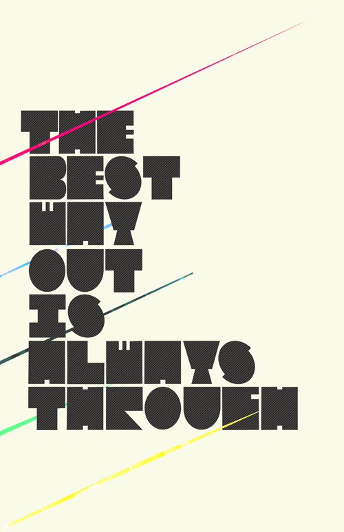
Fig 2.4 Example #4: Experimental Type Poster by freshfauxx

Fig 2.5 Example #5: GO DEEP by THEFUNCTIONALFOX
Sometimes the space used in the piece is the attention-getter. Pieces that are too colourful or crowded are a distraction. Designers try to focus on clean lines and definite shapes in their work to give their pieces character and personality.

Fig 2.6 Example 6: Neighborhood: Alan Kitching by The Random Project
Typographers use white space and a combination of various-sized fonts and font sizes to make a great looking campaign. They also use designs that stack letters vertically and horizontally, colours, symbols, and other design props to give the piece look like there is more than just words. Experimental typography encourages flexibility and creativity which makes it appealing.

Fig 2.7 Example 7: Canada type
3. Digital Art Experimenting
The evolution of typography in digital art form makes experimental typography engaging. Using this experiment, we can test using the complex lighting and manipulation of many letters and shapes which work together to form a flowing design.

Fig 2.8 Example #8: Morning, marine hitch letters by Settka
4. Texture, Tones and Tenacity
Experimental photography uses different textures, depths and tones to build surfaces which usually give a 3D appearance. All these elements can be adjusted to create many forms of the same piece or by removing or layering elements to improve on its effects.
Designers often work diligently until they find what works well. Experimentation with designs and typography tools are really engaging and give creativity/

Fig 2.9 Example #9: AFEX BOX * TYPE \ BUBB by KRFX / FM3
Reference List: Tudose, M. (2019). What is an Experimental Typography?. [online] DeliciousThemes. Available at: https://deliciousthemes.com/what-is-an-experimental-typography-trends-and-examples/ [Accessed 20 Jun. 2019].
Just How Neutral Is Helvetica? by Emma Tucker
Week 12 - Week 13

Just How Neutral Is Helvetica? by Emma Tucker
Week 12 - Week 13
Fig 2.10 Representation of Helvetica used in different images
I came across this article all about the typeface, Helvetica. In many designs nowadays, Helvetica is the most familiar and common typeface used. So it tells why do many designers use this typeface more often.
Many said that Helvetica is the epitome of neutrality. It is known for being the blank page and the typeface that stands behind and lets others do the talking. Helvetica is very successful used in corporate branding such as American Apparel, Knoll and Muji. They have built their visual identities around Helvetica.
The senior type designer at Monotype, Terrance Weinzierl mentions that he thinks Helvetica was so popular with corporate identity because it looks really efficient and trustworthy. It does not look wasteful or polarizing.
A large part of Helvetica's strength is from its perceived neutrality which kept the typeface in use for over the last 60 years. It has inoffensive voice and clarity results in common use on official documents, nutrition labels, public signage, and anywhere that a designer needs a typeface that can be "invisible" but still show the key information.
Take a Back Seat
The Monotype's creative type director, Steve Matteson explained that the increase of usage in Helvetica happened similarly with the printing process that made it easier to reproduce photographs. Photography became important when opening a magazine. In the 60s, there were black and white photos, but with the ease of reproduction of photography, the images became the attention. Helvetica was a secondary to this which is used at the back.
That made people to look at it as a neutral typeface. Helvetica is added at the receding and allow photography, videography or illustration to be the main focus.
Monotype senior type designer, Jim Ford agrees that it is sort of a blank typeface. It is very plain unless we manipulate or exaggerate it to give power to colour and image. It just puts emphasis on other things.
The Myth of Neutrality
However, no design is completely neutral. Typefaces are subject to context and history and changes our opinion of them. It's a typeface that gets certain expressive characteristics but for many cultural reasons, we choose to remove it when we perceive the typeface.
Helvetica also gives a restrained typographic voice, it is worth using it to say the design is more than its reputation.
Half The Story
But there are examples of Helvetica has its expressive side. For many, Helvetica is associated with artwork and flyers for 1970s punk bands. They are created when Letraset Helvetica was widely available. Neville Brody also used the typeface in the 80s for Arena magazine to add emotions in it. Massio Vigenelli even suggested Helvetica Extra Bold for "intensive and passionate" declarations.
Reference List: Tucker, E. (2019). Just how neutral is Helvetica?. [online] Monotype.com. Available at: https://www.monotype.com/resources/articles/just-how-neutral-is-helvetica/ [Accessed 2 Jul. 2019].

Comments
Post a Comment